The Art of Design Spec'ing
Let's learn more about design specs, how to create them, and how they smooth out the hand-off process between design and engineering.
What are design specs?
Design specs (short for specifications) are the instructions attached with a design file to help the front-end engineers with the implementation of the UI of a web or a mobile app.
A bit of history
In the past, these instructions needed to cover all sorts of measurements and spaces in a design. However, when Zeplin was launched it changed the game entirely; It allowed designers and engineers to automatically see parts of the design specs once a design file has been exported to Zeplin.

Things got easier and faster with the rise of Figma where basic design specs show up right in the tool and updates automatically whenever any changes are made to the design.
Why do you need it?
1: Implementation Accuracy: design specs help the engineer better understand how the design should be implemented and how it should behave when a user interacts with it. It also makes designers look at their work from a different perspective and angle, allowing them to cover more edge cases and discover design flows early on.

2: Consistency: creating clear specs makes a designer think more about the consistency & scalability of the UI elements they’ve built, and also gives them a chance to evaluate some of their decisions and adjust the design based on that.
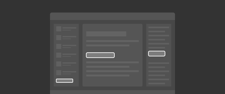
3: Communication: design specs cuts down the time spent in back and forth conversations between design and engineering during the implementation process. It saves everyone time by providing answers to the most common questions about the implementation, and that helps speed the implementation process and makes it more efficient.
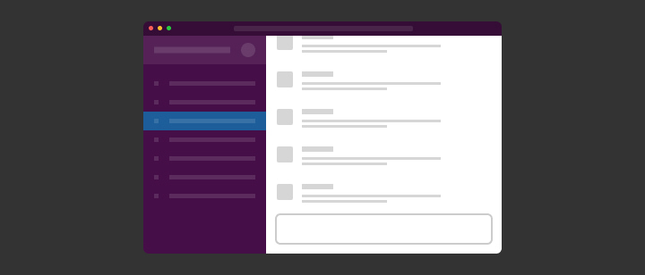
To Summarize: Spec’ing your designs removes a lot of friction between design and engineering and saves everyone a lot of time. This will be a little bit of an investment on the design side, but will have great payoffs; As a designer, you’ll have to do a bit more work before you hand off your designs, but that will minimize the clarifying questions you’d get from the engineers working on implementing your design.
When you should create design specs?
If you’re using Figma or Sketch, you might not need to spec out everything such as widths, height, or even font sizes since this is already displayed automatically in the tool. However, for other parts like responsive or sticky UI elements, you will need to spec them out manually.
In some cases if you’re working in a fast-moving environment like a small startup it might not make a lot of sense for you to spend much time working out detailed specs, you can instead spend more time with the engineers discussing the implementation details.
That being said, even at startups I would highly recommend creating design specs for at least the main parts of your work. This would minimize the back and forth between you and the engineers and would allow them to be more efficient.
What are the spec’ing tools you should use?
You can create the design specs in many ways, the most important thing is to make sure they’re distinguished from the actual design. To achieve that, I recommend using bright unique colors and monospaced font for annotating your specs.
Most of the time I spec out my designs manually in Figma using the line tool with some text for annotation, and in some cases, I use Redlines to speed up the process.
The following are the colors, font, and supporting tool I use in my workflow:
- Colors: I use the colors
#ff00fffor spec’ing light UI’s, and#00fffffor dark UI’s, as both of these colors, are pretty vibrant and neutral and rarely used in any of my designs. I have these values memorized in my head, but you can of course create a color style for each one of them. - Font: I use
Roboto Monoin fairly small sizes12px, 14px, 16pxdepending on hierarchy the spec’ed element. - Supporting Plugin: I sometimes use a plugin called Redlines to help speed up my process as it can automatically calculate the distance between different elements in the design and has a few other cool features that I like.
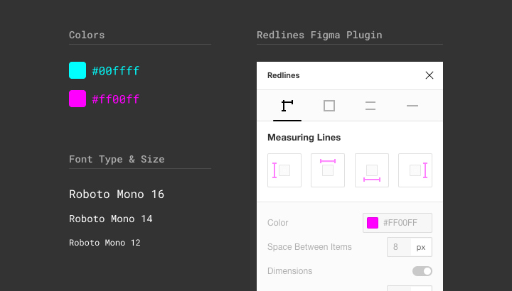
How do you spec out your designs?
Now to the most fun and interesting part of this article!
Below we’ll be going through a few different examples of design specs to explain when and why you should do these kinds of specs.
1: Describing Flows
A clear description below each screen of your flows explaining the logic and interactions on that screen. In many cases, it can just be a one-line explanation of what’s happening on that screen, while in a few other cases it can be lengthly.
It all depends on how complex that screen is, and whether it’s a completely new logic or just an update to an existing screen.
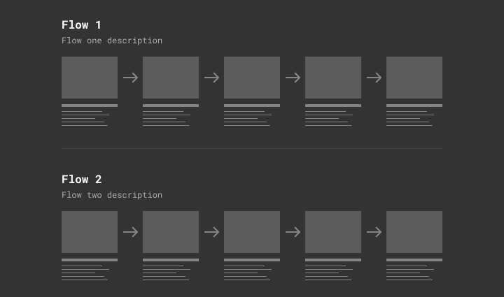
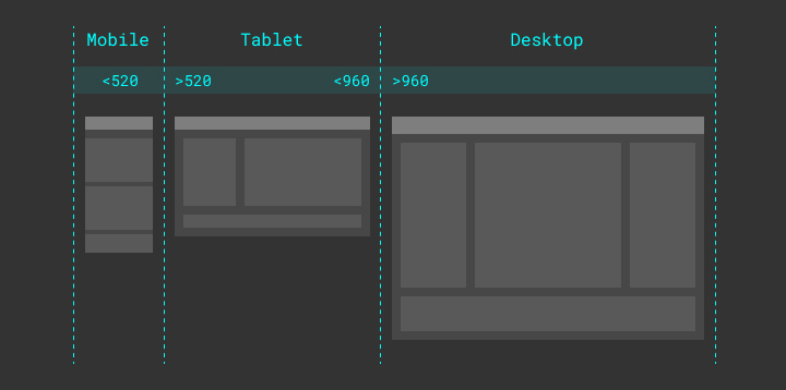
2: Responsive Layout Breakpoints
This is usually created to show the breakpoints in a responsive layout based on the browser window’s width. This can also be applied to vertical responsive layout breakpoints based on the height of a browser window.
3: Sticky Elements
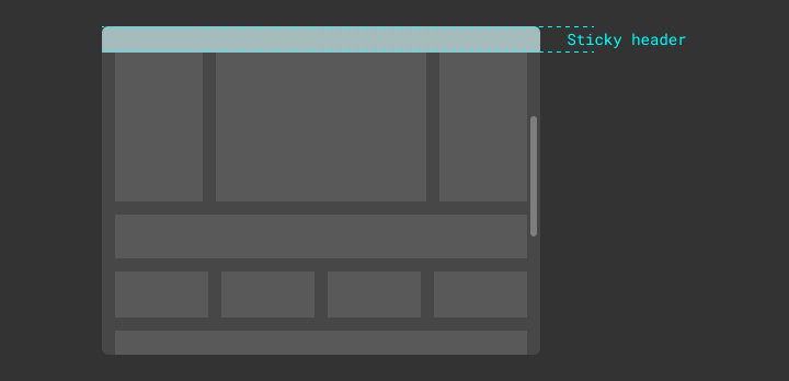
Elements that would stay sticky in a fixed position on the screen when scrolling.
In the example below, you’re looking at a page mid-scroll where the header of that page is sticky at the top.
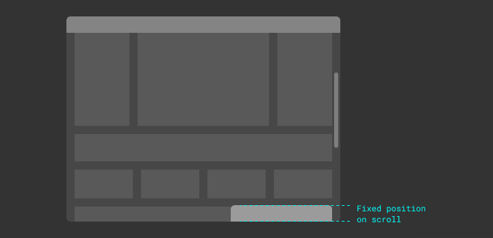
The same thing can be used to spec out elements fixed in other positions on the screen, like a sticky banner at the bottom right corner of the page which is commonly used for an in-app chat.
4: Relative Sizes
Elements with relative sizes (width/height) need to be spec’d with a maximum and minimum width for that element.
In the example below, you can see the middle container spec’d to have a 100% width with a min-width of 240px, and a max-width of 640px, which means that this element will be fluid based on the screen size while maintaining a width between 240px-640px.
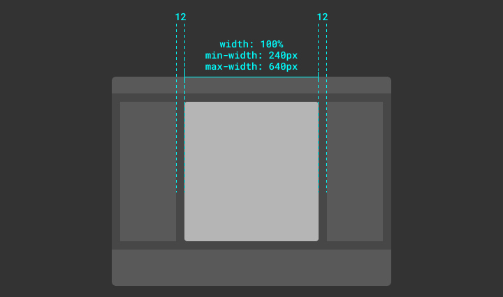
This is also can be used to spec out buttons and other fluid UI elements like a button for example.

5: Buttons & Form Elements
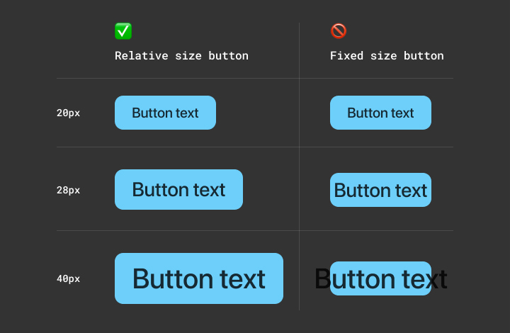
This might be a little bit of a controversial topic, but I strongly believe that you should never specify a fixed value for the height & width of the button unless you really need to.
Instead, you should always let the padding around the text determine the size of the button. That way, it’s guaranteed that your button is always going to work fine no matter what font size you have, font-family, or even text language in that button.

While on the other hand if you have specified a fixed height for the button and later on decided to increase the font size, the button might break because the padding around the text will shrink.
To make sure the button is going to be responsive but at the same time fit in our UI we can define a min & max-width to it.
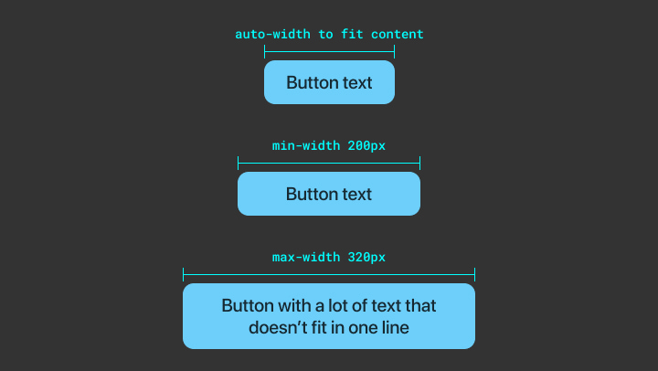
And as for the height of the button, instead of specifying a max-height to it, we can have the text truncate if it exceeds the width of the button, and we can of course decide on how many lines of text we want to allow before we truncate. And if you’re curious here’s a good article explaining how it’s done in CSS.

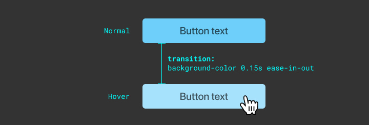
6: Elements States
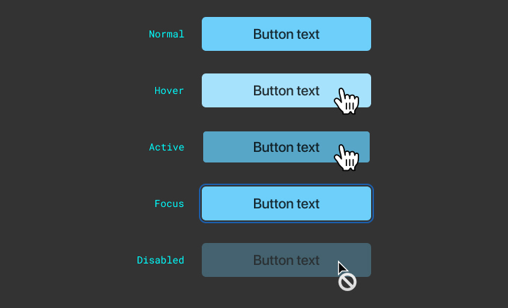
This is to make sure the elements in your design have all the proper states like hover, active, focus, …etc. which is important for the accessibility and usability of your design.
I also recommend including the proper cursor for each state to make sure it gets applied to each state during the implementation.
When you’re spec’ing out a radio button or a checkbox element make sure to include specs for the checked state of that element.
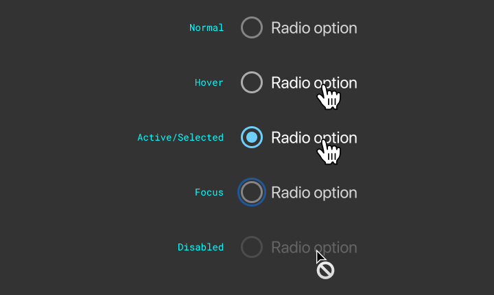
Lastly, to make the UI feel a bit smoother you can always add specs for a transition between the different states. I usually add easing transition with 0.15s duration 0.15s ease-in-out (CSS code snippet but the same thing can be applied in other programming languages like Swift/Java).
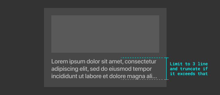
7: Truncating Multiple Line Text
Usually, you would spec out truncation rules for the text if it exceeds a specific height or a specific number of lines by showing ellipses-...
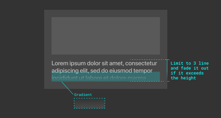
Alternatively, you might want to fade out the text. When you spec that out you have to make sure to annotate the parts of the design that might not be very obvious, which would also help the engineers understand how you think this will be implemented.
In the example below I’m highlighting the lower part of the text to show that this will have a gradient layer on top of it to create the fading effect.
8: Animation & Transitions
In many cases you’ll need to spec out an animated component / UI element, a common example of that is a modal.
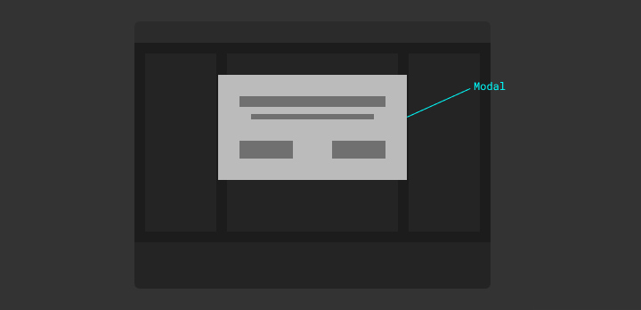
In the example below, you’ll see the specs of a modal that shows up from the top of a screen, where it starts right outside the boundaries of the screen with 0% opacity.
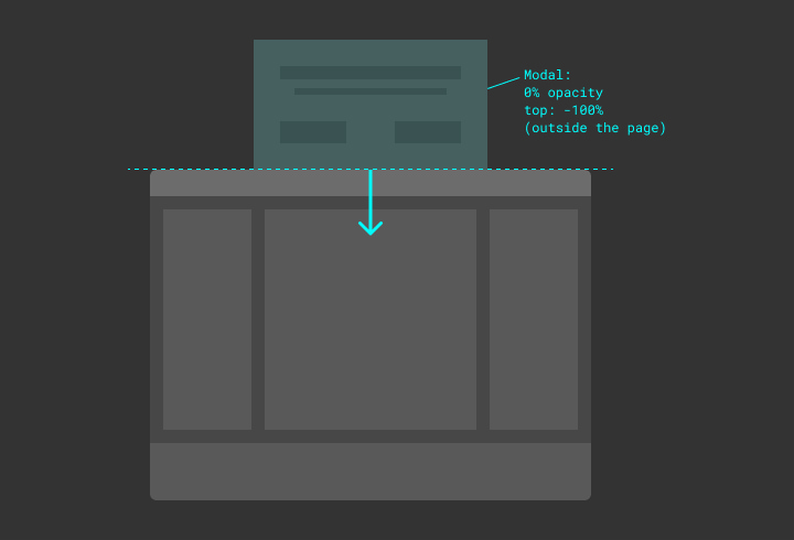
And of course, you’ll need to specify the ending position of the modal and how you want it to transition.
When spec’ing an animated component you need to spec out both the starting and ending position of that component and in some cases the in-between state.
In the example below I’m showing the ending position of the modal with the animation specs (easing and duration). I also added the modal’s max-height to help make sure it always be fully visible on the screen.
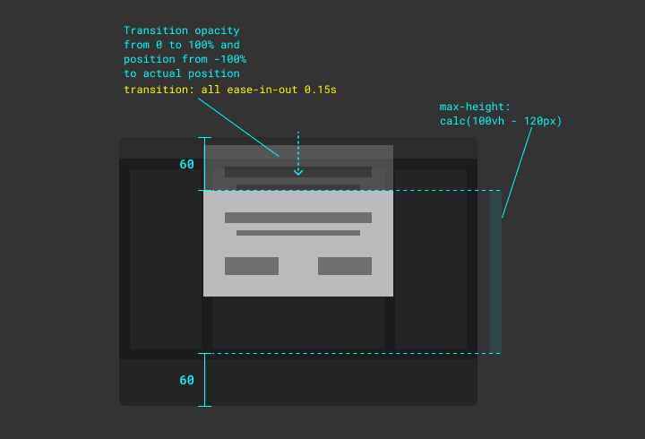
As you can see in the example above I’m using ease-in-out for the animation timing function, which basically means that the element will start transitioning slow, then get faster, and finally slow down before it stops.
Alternatively, you can specify a more sophisticated animation curve by inspecting a web page in your browser where you have an element with a transition set on it. I usually create a quick prototype with a basic transition on Codepen.io and then I start adjusting the animation curve (animation timing function) value to my liking.
P.S. Alternatively, if you don’t have any experience in CSS you can get the animation curve values in Principle App.
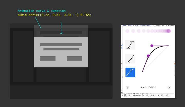
9: Adding Code Snippets
You can always support your specs with a few code snippets to help give your engineers an idea of how you think the feature will be implemented. This doesn’t necessarily mean that the engineer will use your code snippet, but it’ll show them that you’ve spent some time thinking about the implementation and you came prepared with a solution for that, and in many other cases the engineer will actually use your code snippets.
An example of a useful CSS code snippet I shared with my engineering team which they find super helpful is the box-shadow trick to add multiple borders to an element.
box-shadow: 0px 0px 0px 4px #333333, 0px 0px 0px 6px #ffff00,
  0px 0px 48px 6px rgba(255, 255, 0, 0.24);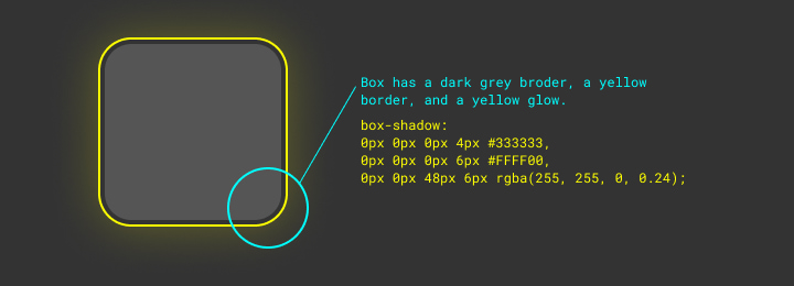
Another example is position: sticky which makes an element sticky on scroll, and flex: 1 which allows an element to expand to fill the space in its flex container.
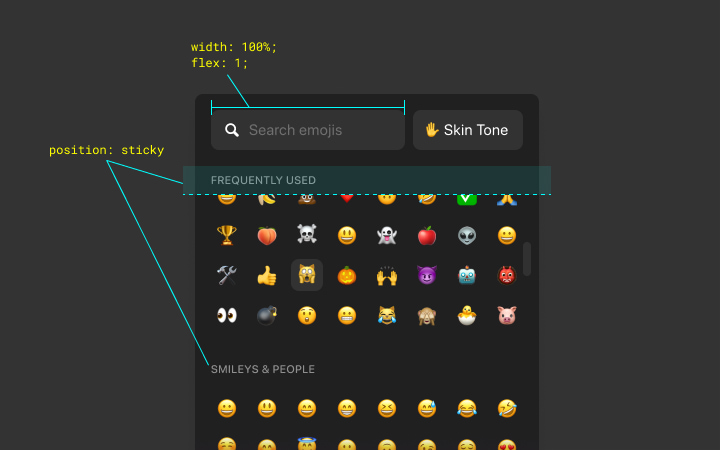
10: Scrollbars
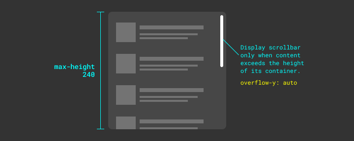
In some cases, you will need to have a scrollbar within a container.
In the example below a container with a max-height of 240px, while the content inside of it exceeded that height limit, therefore we’re showing a vertical scrollbar. This, of course, can also be applied to horizontal scrolling.
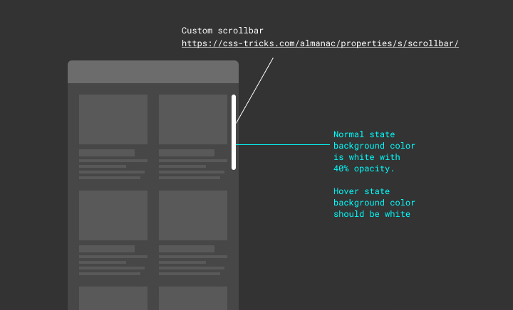
Styling the scrollbars is usually missed out during the implementation process, and for that reason, it’s always worth calling it out in the specs.
I also usually include a direct link to a great CSS Tricks article with tips for customizing a scrollbar (hint: links can be clickable in Figma!).
[Bonus] 11: Spec’ing With Prototypes
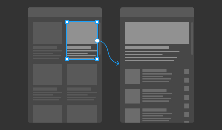
In some cases, these specs might not be enough to show the engineers how exactly you want your design to be implemented and to behave when a user interacts with it.
Creating a prototype for your design can be super helpful in these situations, and at the same time, this prototype can also be used for user testing and to collect feedback from the users.
11 A: Spec’ing in Figma/Sketch
There are different tools for creating prototypes, and usually, the fastest way to do it is by using the prototyping tool in Figma/Sketch, which can be sufficient for basic interactions.
11 B: Spec’ing in Principle App
In case you were working on a more sophisticated interaction and you needed a more detailed prototype to show and test that you can use Principle App which allows you to create prototypes with a lot of details in a short amount of time.
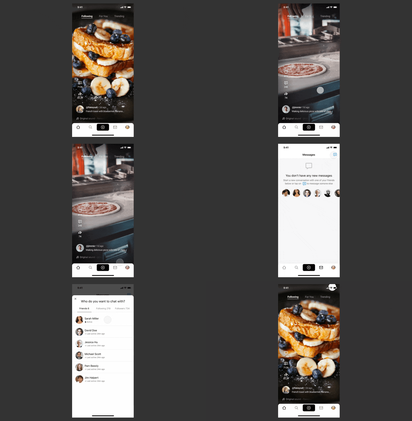
11 C: Spec’ing in Code
In some other cases, you might want to choose to create a prototype in code, where you can even use real data, make changes on the fly, and most importantly, build something the engineers can use partially or fully.
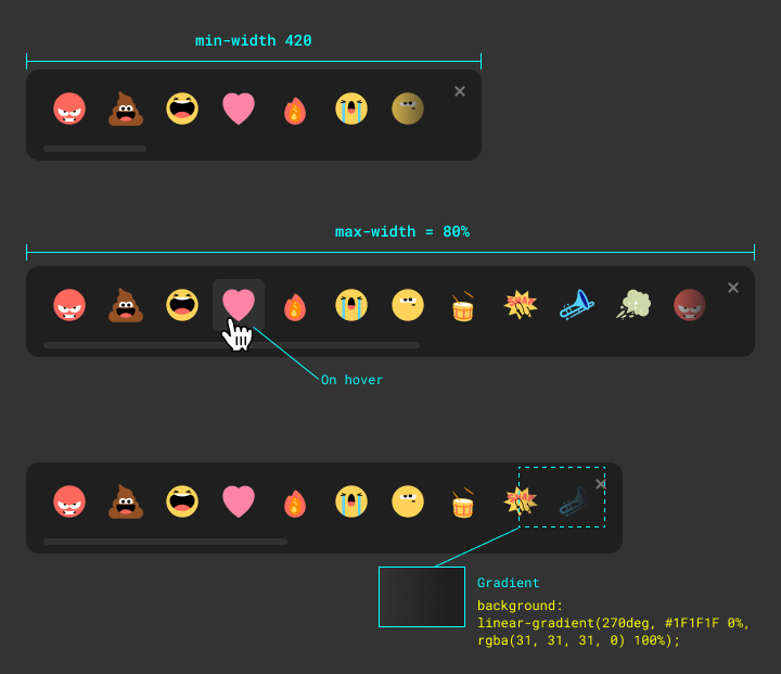
Below is an example of a prototype I created for the reactions feature in the Airtime app. I created this prototype using Vuejs and CSS, and it was the best way to show how it’s supposed to work and be implemented, while at the same time was super helpful to make quick tweaks to the timing and the animation.

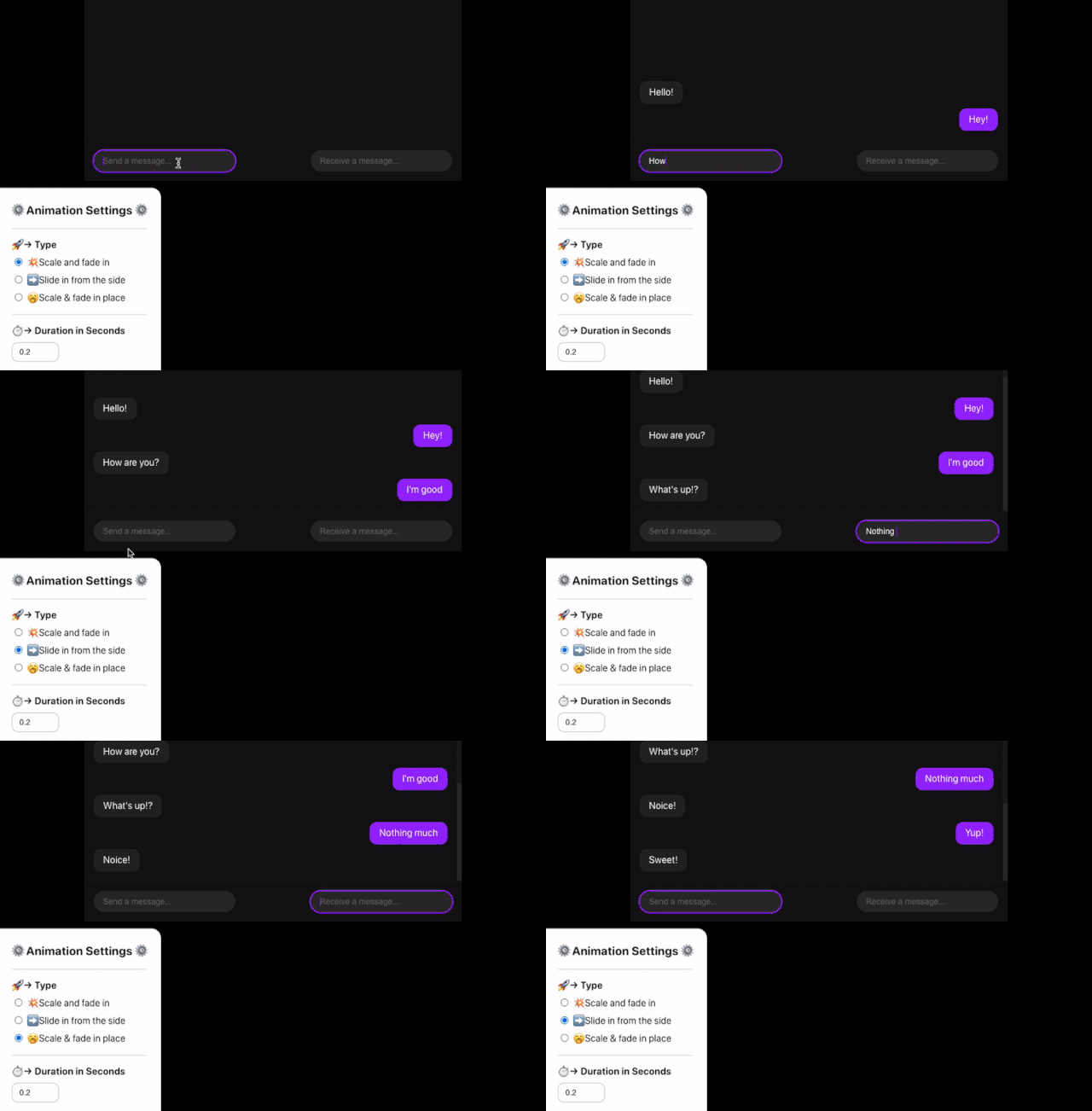
Another great advantage for creating a prototype in code is that you can add controls to manipulate parts of the UI to better test it and tweak it on the fly.
In the example below I’ve created a prototype for the micro-interaction of the appearance of a chat bubble in the Airtime app. I’ve also added a settings panel to help us test different animation styles and to change the duration of that animation.
Real-Life Examples
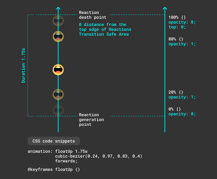
Here are 3 examples of specs from a couple of projects that I’ve created recently.
1: Reactions Bar
2: Animation
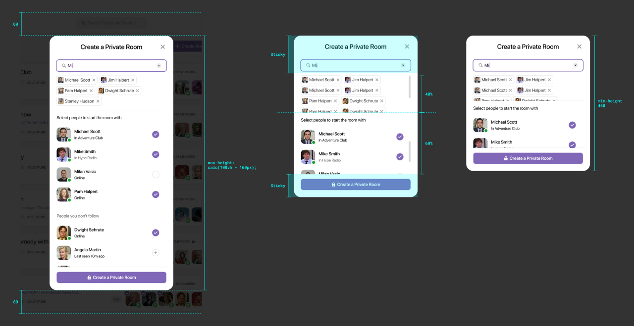
3: Complex Modal
Ending Thoughts
This was the end of my first article in my personal design tech blog. I hope that you liked the article and found the information to be helpful and useful.
I’d love to hear your thoughts and feedback on the topic, let’s connect and chat about it on Twitter @mahdif.
Share = 💞
If you liked the article please share it with others on Twitter & other social networks! I would really appreciate that.
