Building disposable UI
When AI hands me nine options, I build a page to judge them, then throw the page away. The decision is the only part I keep.
This week I listened to 72 sound effects on a page Claude Code built for me. I picked my favorites. I will never open that page again.
I build pages like this almost every day now. Not products. Small, throwaway interfaces with one job: help me judge something. Which sound. Which thumbnail. Which layout.
I call it disposable UI. Here is what it looks like in three kinds of work, and what it taught me.
Why a page beats a folder
AI rarely gives me one answer. It gives me nine.
Judging nine things in a folder means opening a file, listening, opening the next one, and forgetting the first. A page puts all nine in front of me, side by side, in context.
One user, which is me. One job. One lifespan: until I've decided.
Watching: video editing
A video editor wants me to commit. So I build the comparison next to it.
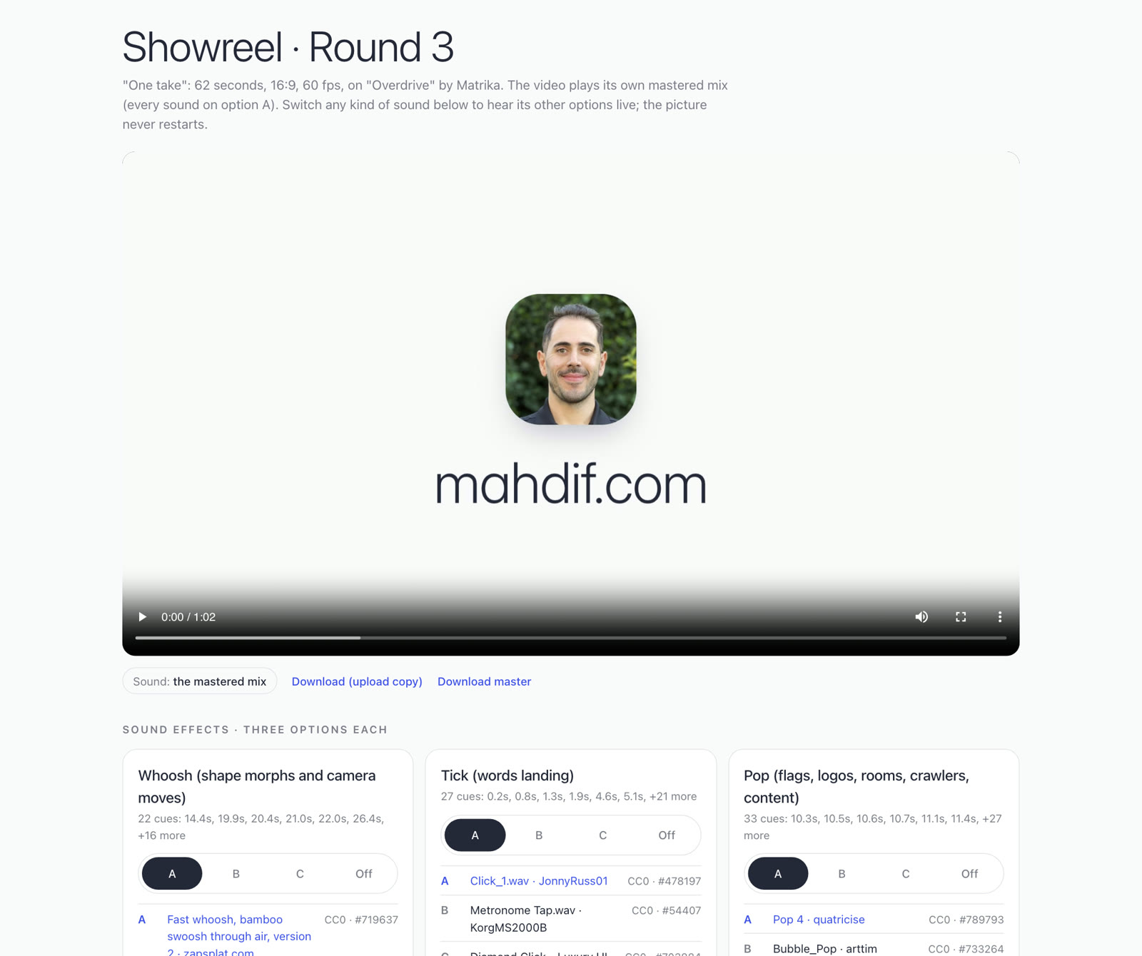
For my showreel, every kind of sound effect got a switch: A, B, C or off. The video keeps playing while I flip, so I hear each whoosh where it will actually land.
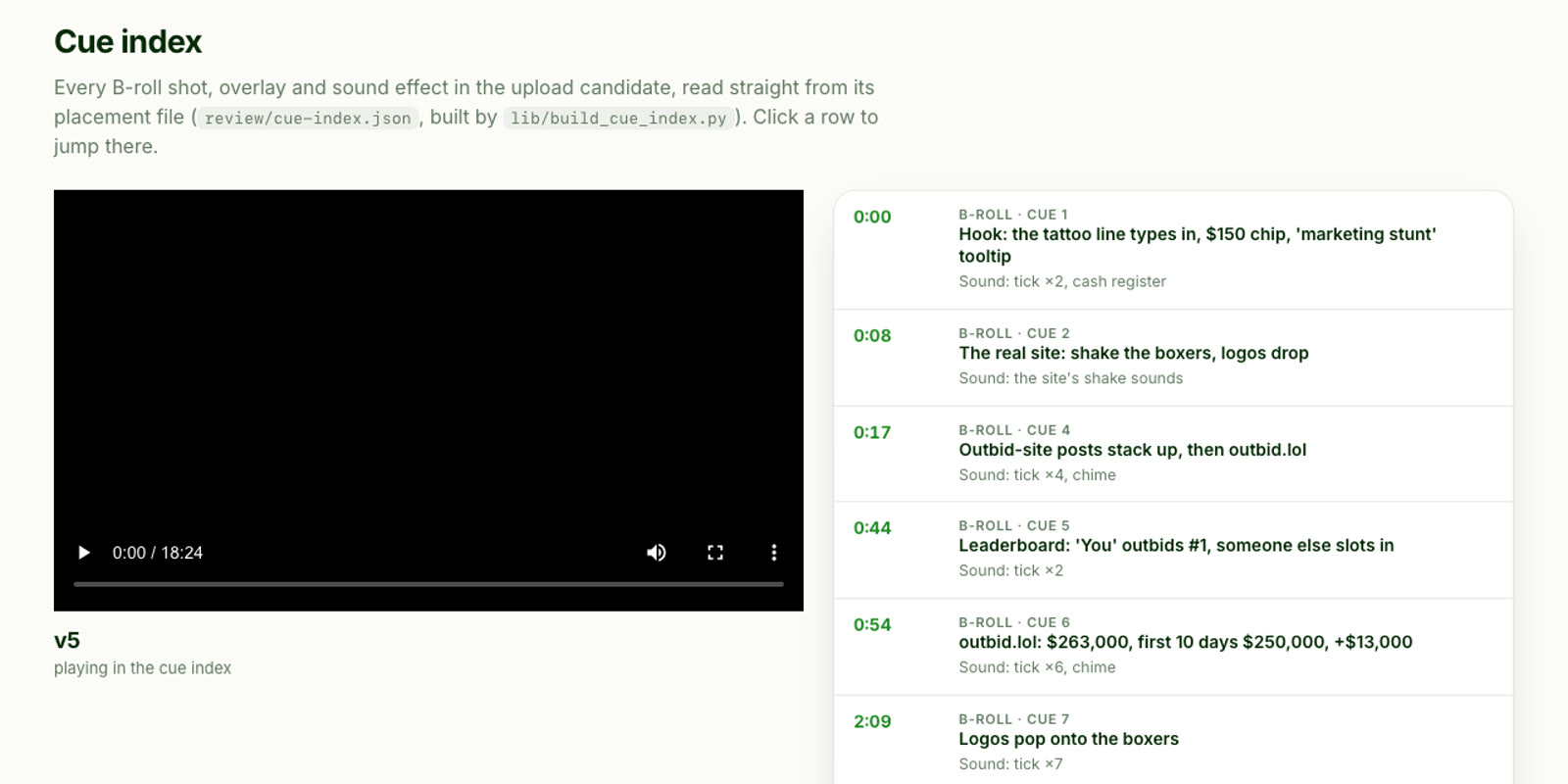
On a longer video I wanted to jump straight to the parts I was worried about. So the page lists every shot and sound in the cut. Click a row and the video goes there.
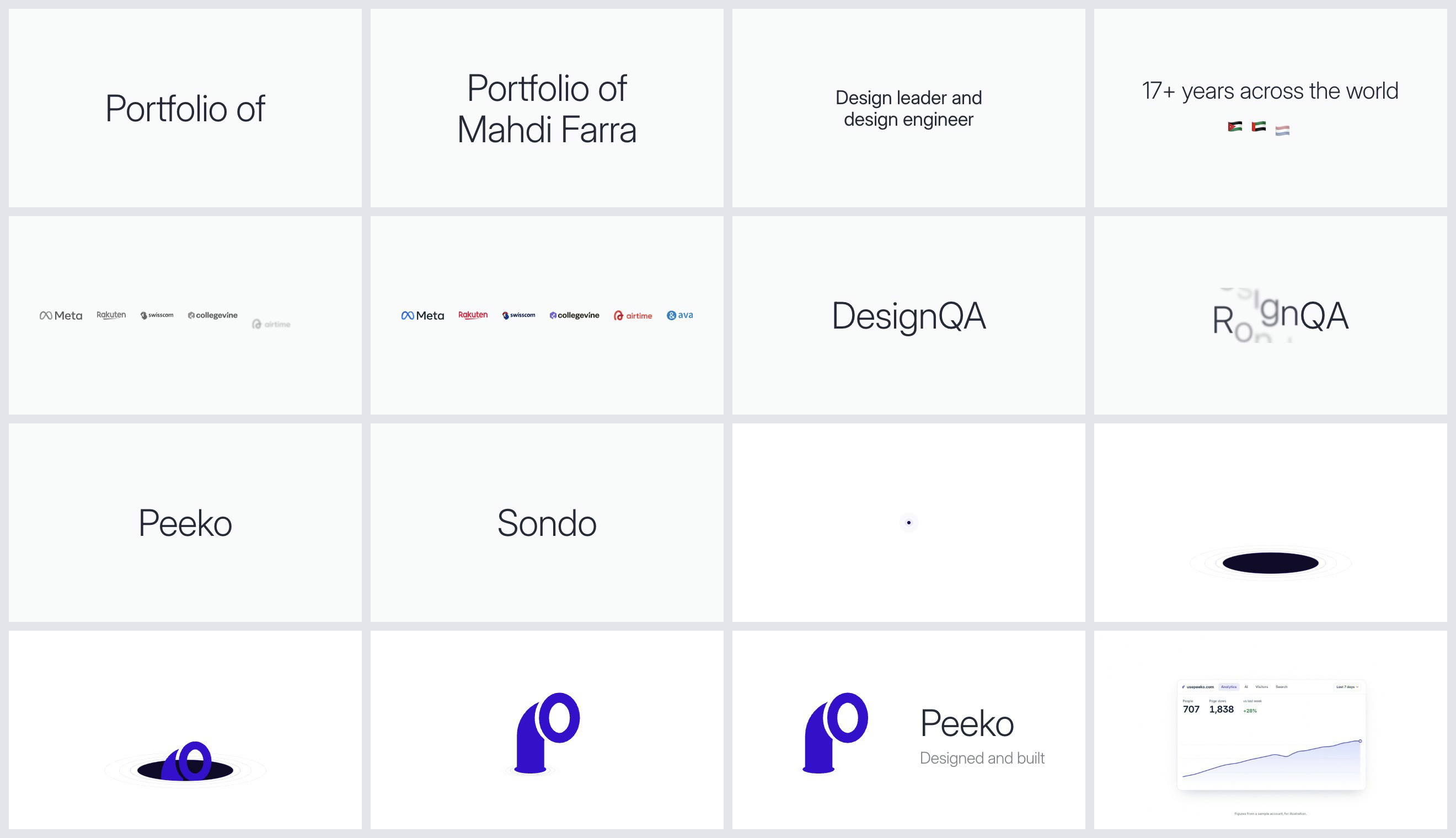
And before anything renders, I lay the key frames out on one canvas. Changing a still is free. Changing a render is not.
Hearing: the blind sound test
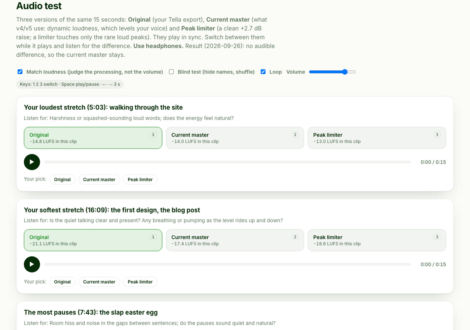
Sometimes the answer is that there is nothing to fix. I compared three masters of the same video, matched for loudness, and couldn't tell them apart. The master stayed. A page that says "stop fiddling" saves more time than one that tells me what to change.
The sound effects test is the one I'd tell you about at dinner. Eight kinds of effect, nine takes of each. Three from a free library, three from a model running on my Mac, three from ElevenLabs. All the same loudness, shuffled, with the source hidden until I submitted.
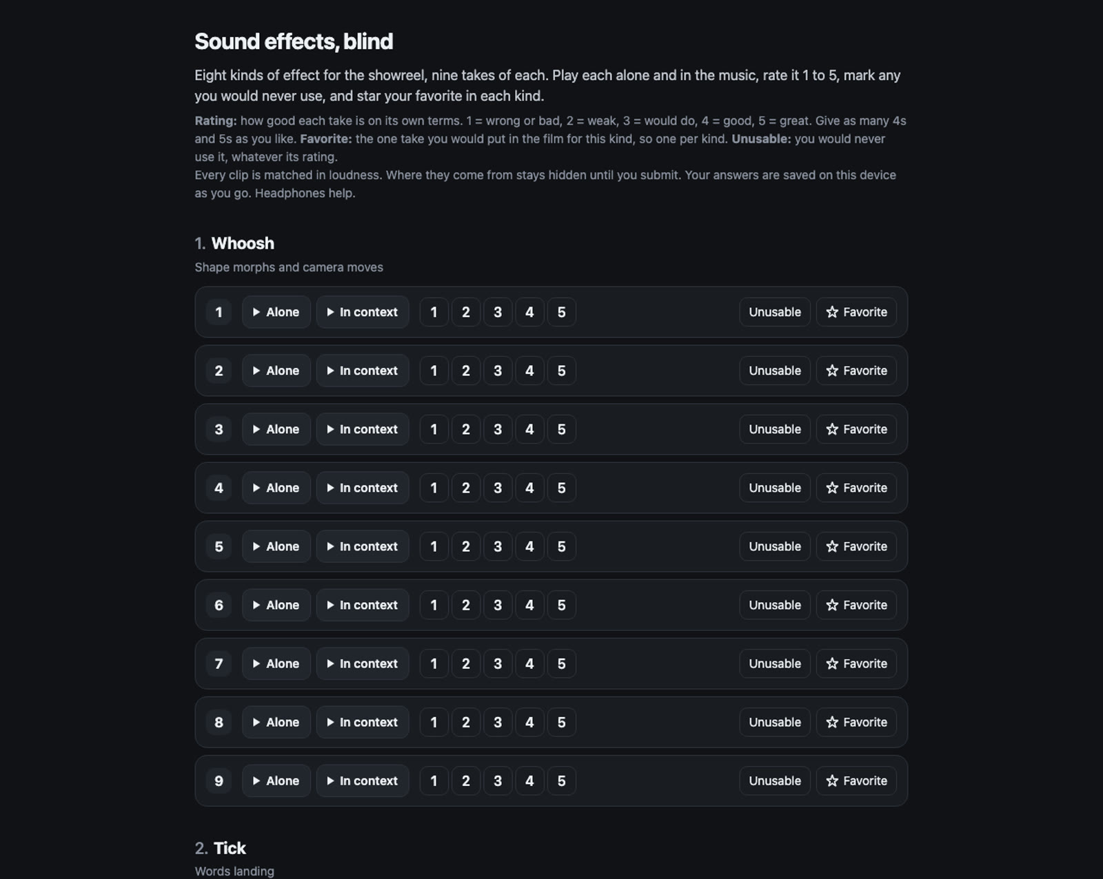
Three things came out of it.
The sources were close. The generated sounds held up next to the library ones, all within a third of a point out of five.
An AI couldn't pick for me. I asked an audio model to rank them, and it matched my favorite in one kind out of seven.
And I'm not consistent. The page quietly repeated two sections at the end. On one I matched my own ratings almost exactly. On the other, barely.
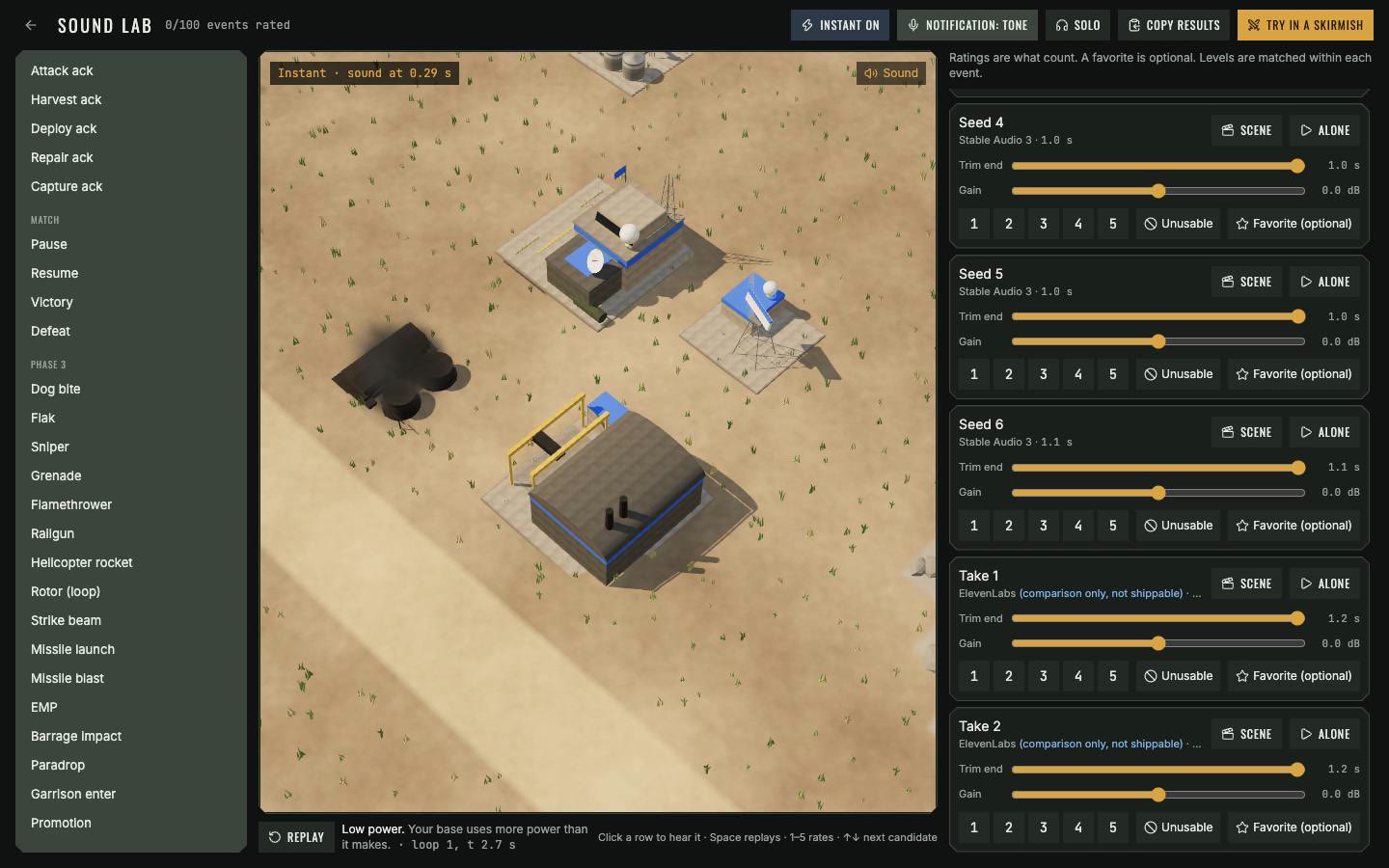
The next day the same idea moved into Warbloc, the strategy game I'm building. Each sound plays inside a looping scene, at the exact moment the game would play it. I rated 412 candidates there, and 69 of the game's sounds are ones I picked.
Looking: design with knobs
For design, I ask for a mockup and a control panel for that mockup in the same file. The refresh of this site had seven directions with 45 controls each: colors, fonts, spacing, motion.
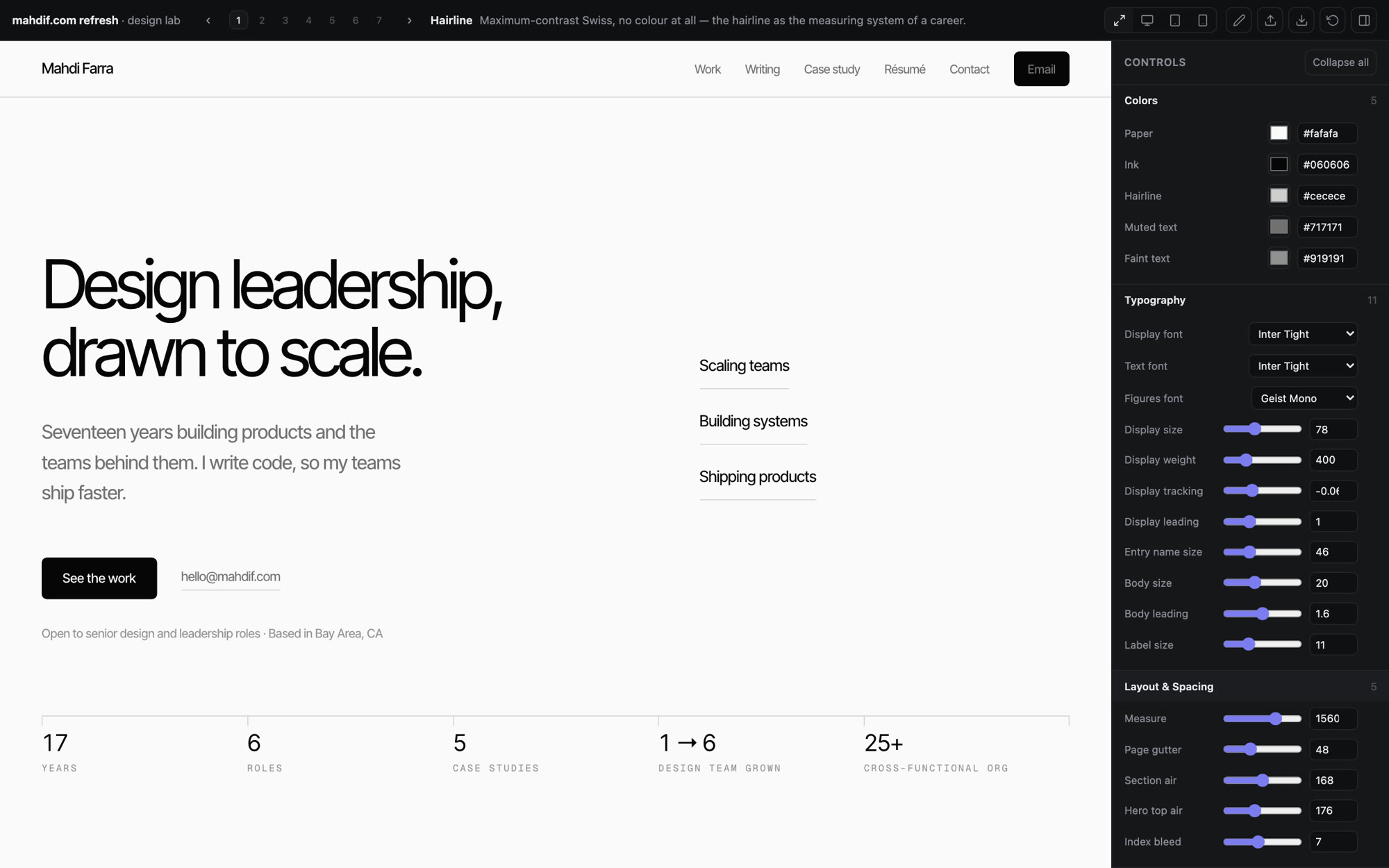
When it looks right, I export. This is everything that leaves the lab:
{
  "variant": "variants/01-hairline.html",
  "name": "Hairline",
  "tweaks": {
    "--h1-size": 96,
    "--band": 208,
    "--gutter": 64
  },
  "customCss": ""
}
I paste that into Claude Code and say build the real thing from this. The mockup itself never gets used.
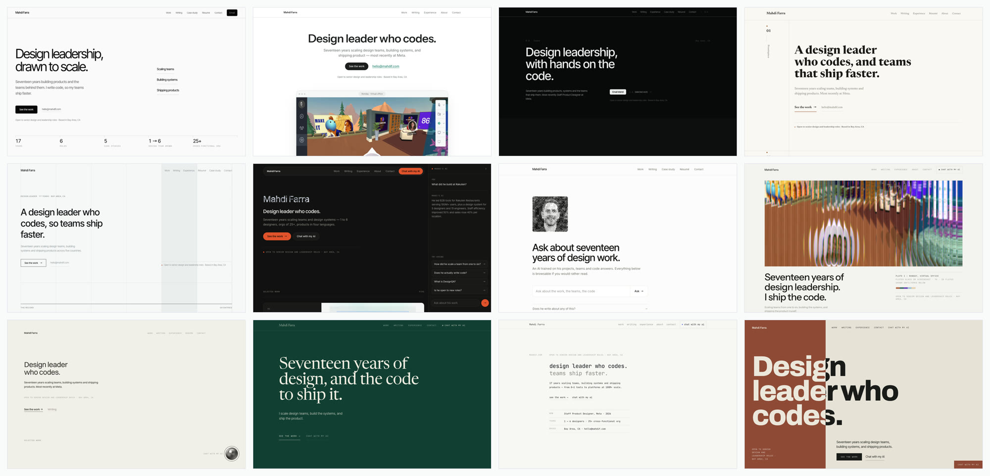
It took four rounds, and in the end I drew the final design by hand in Figma. I couldn't have drawn it first. The mockups showed me what I didn't want.
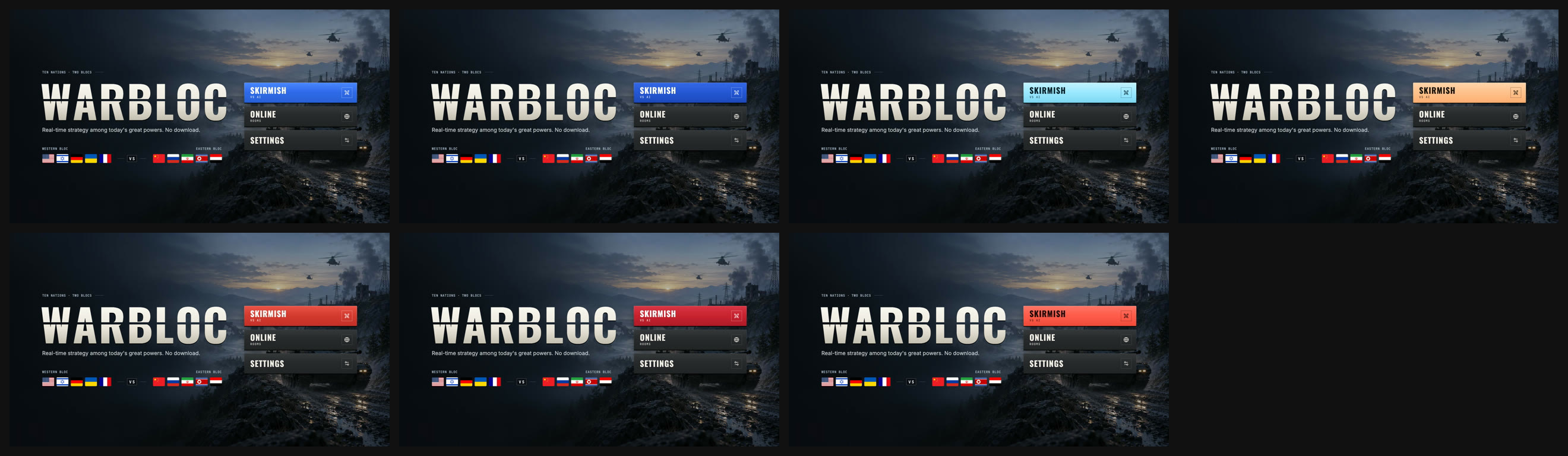
Smaller calls work the same way. Seven button colors on the same Warbloc screen:
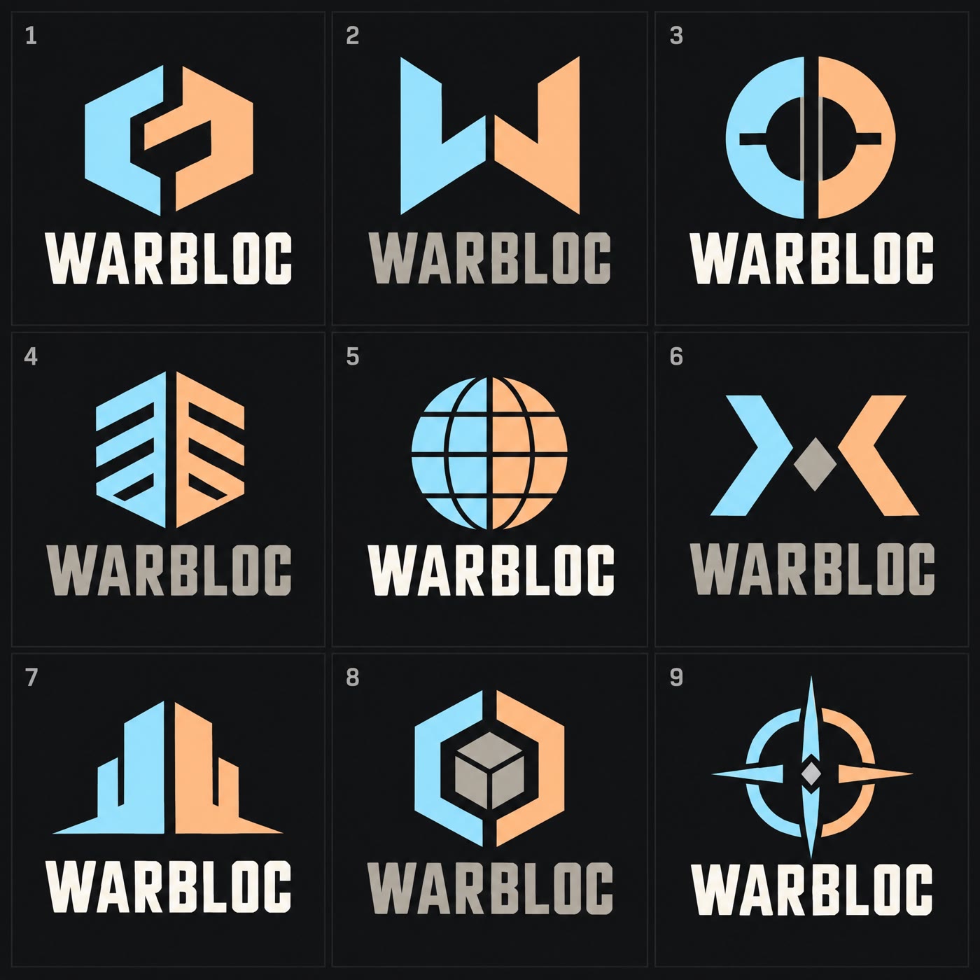
Twenty seven logo concepts for 30 cents, to pick one I then redrew myself:
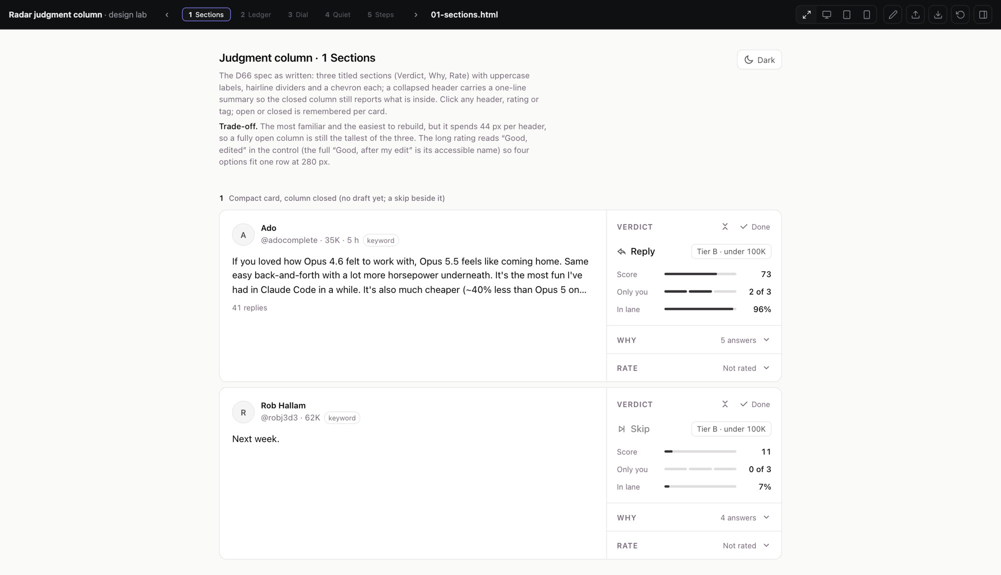
And a column for rating posts in one of my tools, which went from first mockup to merged in about an hour:
When to build one
Build one when you're arguing with yourself. Going back and forth in your head means you can't see enough options at once.
Build one when judging needs a sense a chat window doesn't have. Hearing it, seeing it at feed size, feeling the spacing.
Build one when the answer should be blind. Hiding the source and the order is tedious by hand and trivial on a page.
What it doesn't do
A page doesn't tell me what's right. Before any of the site mockups existed, I wrote down what wasn't allowed:
- Gradient text of any kind.
- Glassmorphism, frosted panels, backdrop-blur decoration.
- More than one accent hue. Zero is a legitimate and welcome choice.
No slider produced that list. Taste picks the direction. The knobs only make it exact.
It isn't free either. 412 ratings is hours of listening.
And it has to stay disposable. I once let one grow into a real tool for making share images. Within a day I was telling Claude that Figma was easier.
The part that moved
Building the tool to decide used to cost more than the decision. So I decided by feel. Now the page costs minutes, and my time goes to the decision.
The code is disposable. The decisions are what I keep.
Get new posts by email
I write when there is something worth saying. One email per post, nothing else.

- ai
- design
- craft
- workflow