Paper is awesome but not perfect
I spent a few days trying to move my daily design work from Figma to Paper. What I loved, every bug I hit, and a suggested fix for each one. Ten years after I did the same thing to InVision.

I have been a product designer for 17 years. I started in Photoshop, slicing designs by hand and writing the HTML and CSS myself. Then I watched the tools move. Photoshop to Illustrator, Illustrator to Sketch, Sketch to Figma. A shift like that is something you can feel coming before it lands.
It is happening again, this time around AI agents. Paper is the tool I find most interesting, because its canvas is not a rendering engine imitating the web. It is HTML and CSS. So I spent the last few days trying to make it my daily tool.
Ten years ago I ran this same exercise on InVision, in a post called "InVision is Awesome But Not Perfect". A week later, InVision's CEO emailed me.
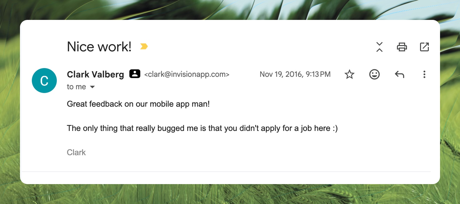
This is the 2026 edition, under the same contract: real problems, real screenshots, a suggested fix for every single one, written by a fan.
What Paper gets right
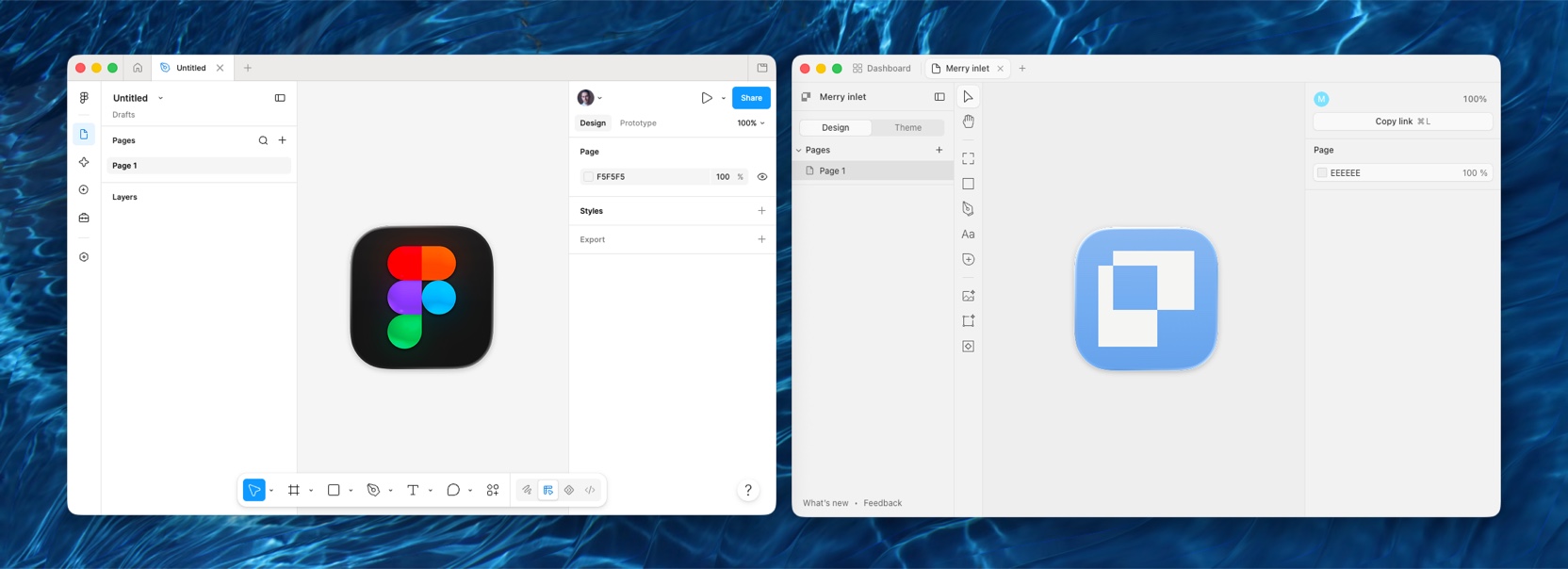
If you come from Figma, you are home in about a minute. That is a real achievement, and also a trap I will get to later.
The UI is calmer than Figma's. Controls are slightly larger, panels breathe, nothing fights for your attention. Figma has always felt like everything is one size too small, and you only notice how much that costs you when it stops. I did not expect to prefer another canvas this quickly.
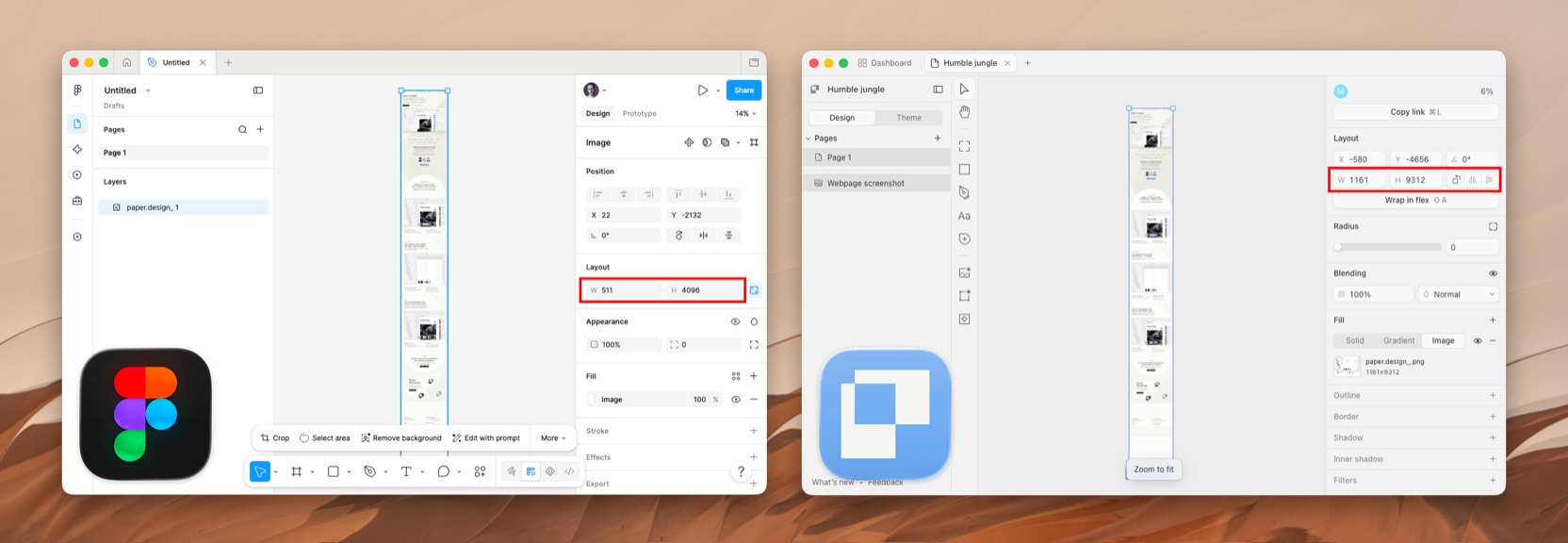
Tall imports are another quiet win. Figma downscales tall imports past its size cap, which ruins full-page website captures. Paper took my longest captures at full resolution without complaint.
And then there are the shaders. The shaders are incredible. This is not a casual compliment: I already use them in production. Every share image on this blog runs through a pipeline that lays one of Paper's shader treatments over a photograph. And this post's cover went further: I designed the whole card in Paper.
Scaling is broken, and the scale tool is missing
In Figma, you select an element, hit K, and scale. Everything scales together, borders included. You never think about it, which is the point.
Paper, as far as I can find, only has resizing, and resizing is not scaling. When I gave an SVG icon an explicit width and height in the layout panel, the whole composition got mangled.
Figma even carries an escape hatch for exactly this situation: outline stroke, which flattens borders into the shape itself so an icon survives any resize. Paper has an outline property, the CSS kind, but no flatten command. So when resizing breaks an icon, the only fix I found was rebuilding it.
For me this is the single biggest blocker to using Paper full time. Icons are the stress test: small, border-heavy, resized constantly.
How I would fix it: ship a true scale mode that multiplies every property, borders and radii included. And add an outline flatten command, because sometimes flattening is the right answer.
Shaders are the best feature, and they are fenced in
Shaders live as their own element type. You create a shader object and design around it. But the moment you love the feature, you want it as an effect on things that already exist. I wanted to run a shader over a logo. There is no way to do that.
Here is the strange part: the limitation is not in the shaders. Paper open sourced the whole library at shaders.paper.design, and there the logo shaders happily take an SVG as the source. It is the app that gets in the way. Pick an SVG with the eyedropper and Paper converts it to WebP, a rasterized version, before the shader ever sees it. The shader then renders a soft, low resolution copy of a logo that was crisp vector all along.
How I would fix it: make shaders an effect or fill that can attach to any layer, the way blur works everywhere else. And pass vectors through untouched. The shader library already accepts SVG, so stop flattening the source before it gets there.
Let me export the frame I just designed
Here is the feature I kept looking for: select a frame, export it as HTML and CSS. It does not exist. The export panel offers PNG, JPG, AVIF, WebP and PDF. Five formats, and not one of them is the format the canvas is actually made of.
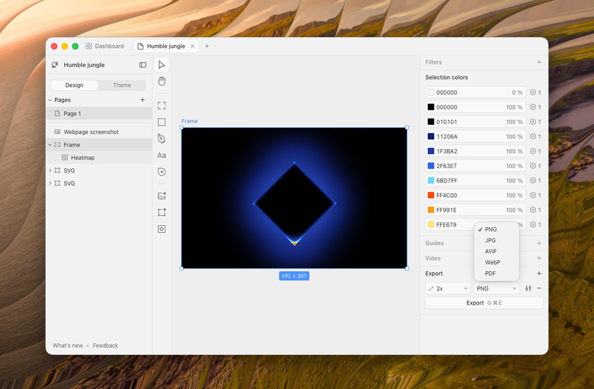
This confused me more than anything else in the app, because the frame already is HTML. The hard part is done. The download button is the easy part.
I suspect the assumption is that agents handle this through Paper's MCP server. If so, I think that assumption is wrong, or at least incomplete. An agent export burns tokens every single time, for something deterministic that is already sitting there. Some things are better as a button: faster, free, and no model in the loop. A canvas made of HTML that cannot hand me the HTML feels like a door with no handle.
Then the export that does exist bit me, on this very post. That cover I designed in Paper? On the canvas it is three tidy lines above a small byline. The exported PNG came back in a much heavier font, which rewrapped the lines and drove the title straight into the byline. What the canvas shows and what the file contains are two different designs.
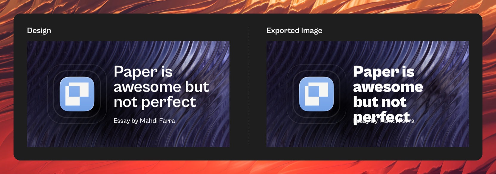
How I would fix it: HTML and CSS as one more entry in that export dropdown. Ship the straightforward version first, absolute positions and all, and let it get smarter over time. And make the raster export pixel-faithful to the canvas. An export you cannot trust is an export you stop using.
The app hides its own superpower
Paper's whole bet is that design tools become the surface AI agents read and write. And the UI, in everything I could find, never mentions it. No call to action, no hint, nothing that says "here is how to point your agent at this file."
The result is strange: to someone who just installed it, Paper reads as a smaller Figma, because the thing that makes it more powerful than Figma is invisible. That is the trap from the top of this post: feel exactly like Figma, and you get judged as a smaller Figma. The website tells the story, but the product should not depend on the website.
The same discoverability problem shows up smaller. The onboarding file mentions copying an element as React from the right-click menu. I could not find that option. What I eventually found was "Copy as React CSS," a different name in a different place, and it took longer than it should have.
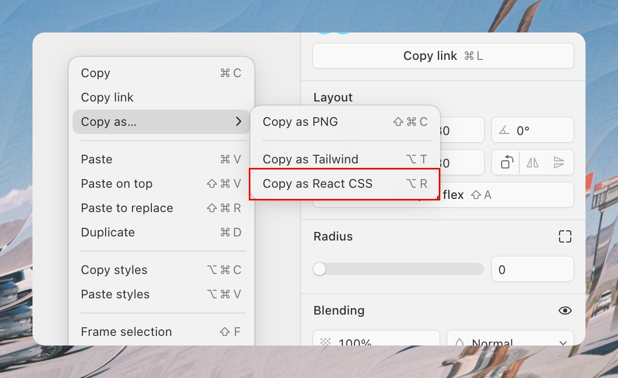
How I would fix it: put the agent workflow one click away. Every file gets a button that shows exactly how to work on this design from Claude Code, Codex, or whatever agent you use, with the MCP setup ready to copy. And name menu items what the tutorial names them. The tutorial is a promise the UI has to keep.
Small things that add up
The border plus button. Click it once and it adds a border. Click it again and it splits the border into per-side controls. But everywhere else in the panel, shadows included, clicking plus again stacks another instance of the same effect. Same button, different meaning, one panel apart.
And the spacing inputs. Padding in Paper takes two values, and the first sets left and right while the second sets top and bottom. That is Figma's convention, and CSS reads the same shorthand the opposite way: top and bottom first, then left and right. Paper's canvas literally is CSS. Anyone who knows a little CSS arrives with that order in their fingers, and Paper follows Figma instead of the web it renders.
And image fills. In Figma, an image inside a shape can be set to fill, fit, crop or tile, and you can resize and reposition it inside its container however you want. Paper has nothing like it: the image is just the element, and the only workaround is wrapping it in a frame and nudging things around by hand. Anyone switching from Figma reaches for this in their first hour and finds it missing.
How I would fix it: plus always means "add another one," with per-side control on its own affordance, like the split-sides toggle in browser dev tools. Read two-value spacing the way CSS reads it. And give images the fill modes designers already know: fill, fit, crop and tile, on any image, no frame gymnastics. The canvas speaks the web's language; the inputs should too.
Where this leaves me
I still open Figma every day. That is the honest summary.
Some of that comparison is unfair. Paper is two years old and Figma is a decade of compounding work, so counting features misses the point. But patterns are a choice, not a backlog item. A plus button that changes meaning, a tutorial that names a menu item that does not exist, a superpower the UI never mentions. Those are decisions, and they are fixable this quarter, not this decade.
Four things would move me from visiting to living here: a real scale tool, shaders as an effect on any layer, image fill modes, and export that works without an agent in the loop.
People keep asking whether Paper can kill Figma. I think that is the wrong question. Figma won by moving design into the browser. Paper is betting on moving design into the web itself, a canvas agents can read and write natively. The bet is right. The adoption will come down to boring things, like a scale tool and a download button.
If you are on the Paper team and reading this: the contract from ten years ago still holds. This is fan mail with screenshots.
Get new posts by email
I write when there is something worth saying. One email per post, nothing else.
- ai
- design
- tools