Skip to content
All posts

People told me my site looked AI-generated. So I designed it 12 more times.

New
5 min read

My portfolio got called AI slop, for choices I had made on purpose. The fix was more AI, pointed at exploration instead of production. Four rounds in three days, one more pass in Paper, and no single winner.

Earlier this summer, a few people told me my site looked AI-generated. Not the writing. The design. I have been a product designer for 17 years, and my own portfolio read as slop.

The strange part is that I had designed it. The pastel aurora, my name in a handwritten script with a gradient running through it, the glowing button. I drew those in Figma and built them with AI. Gradients have been my thing since long before AI. But AI has since made that kind of gradient its signature, so people saw it and filled in the rest. The long copy and the heavy type didn't help.

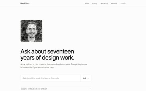
Two versions of the home page side by side. Left, the old one: the name Mahdi Farra in a handwritten script with a blue to pink gradient, a long heavy headline, and a button with a pastel rainbow glow. Right, today: a portrait, the name set plainly, a two line title, and two quiet buttons.
Before: a script name in a gradient, a long headline, a glowing button. After: the page you're on.

So I redesigned it. Four rounds with AI agents in three days, 23 mockups, and a new site live by August 11. Then seven more directions in Paper in September. Here is how it went, in order, including the round where I was confidently wrong.

six weeks laterAug 6Round one7 pages, 7 agentsAug 7Two more rounds10 more mockupsAug 8Round four6 component sheetsAug 11Shippedthe redesign goes liveSeptemberPaper7 directionsSept 26Shipped againthe page you're on
Two redesigns, six weeks apart.

First, the taste file

I keep a taste file. It's a plain markdown file that tells every agent how I like things. The section for this site listed the gradient wordmark, the glow button and the shader hero as features.

TASTE.md
## The modes (pick by product type)
- **Mode C — editorial / brand.** The public portfolio + blog (mahdif.com): a **refined-minimal reading base**
(light-first, hairlines, no shadows, self-hosted sans body, generous measure) with **branded "juice" layered
on top** — an animated gradient wordmark, a glow CTA, a Three.js shader hero, and ambient Howler SFX. Quiet
where you read, expressive at the brand moments. Use for personal-brand / marketing surfaces.
My taste file, the section for this site. What people read as AI was written down as a feature.

So the brief started from that file and then overruled half of it with a ban list. No gradient text. No aurora blobs. No script fonts, no graph paper, no glassmorphism. What I meant by my gradients no longer mattered. What people read into them did.

August 6: seven agents, seven pages

Seven agents got the same brief and the same real product screenshots. Each one built a whole page as a single throwaway HTML file, about a thousand lines with 45 live controls for type, color and spacing.
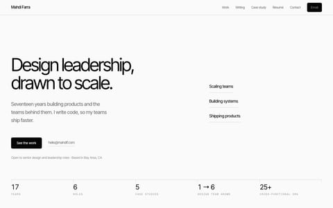
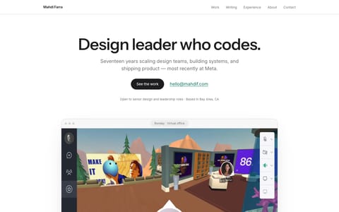
One brief
My taste file plus a ban list, sent to seven agents
agent 01
Hairline
1,291 lines
agent 02
Gallery
902 lines
agent 03
Ledger
1,181 lines
agent 04
Atelier
1,185 lines
agent 05
Rule
942 lines
agent 06
Companion
1,276 lines
agent 07
Ask
1,173 lines
Round one. One brief, seven agents, seven single-file pages.

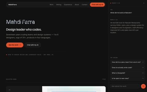
I picked Companion. A near-black ground, a vermillion accent, and a chat panel docked on the right. Round two spent the next day refining it.

August 7: I was wrong

Then I looked at a day of dark pages and orange, and wrote this into the next brief:

"I think we have excessively been focused on this style with the orange theme and the dark background."

Round three banned the palette I had just picked and went five other ways. A day earlier I had been sure. Now I could see it was a mood, not a direction.

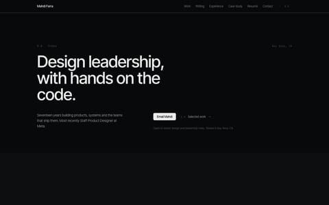
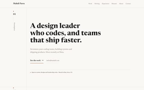
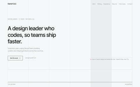
A grid of twelve full-page website mockups. The first seven are round one: Hairline, Gallery, Ledger, Atelier, Rule, Companion on a near-black ground with an orange accent and a chat panel on the right, and Ask. The last five are round three: Aperture, Orb, Pigment on dark green, Terminal in monospace, and Planes with a rust red block.
All twelve whole-page directions. Round one is the first seven, Companion is the dark one in the middle row. Round three is the last five.

August 8: parts, not pages

Round four stopped designing pages. It was six component sheets: buttons, post lists, the chat, my name. It also gave me my gradients back, with one rule. A gradient is allowed inside a small object, like a button or a mark. Never as the page background.

Six component specimen sheets in a grid: Vapour, a cool light sheet; Reeded, dark ribbed glass; Duotone, two inks on paper; Graphite, dark metal on bone paper; Riso, blue and pink ink on warm stock; and a hero shader sampler.
Round four. Six component sheets, no pages.

The problem was never gradients. It was gradients as wallpaper.

August 11: what shipped

No direction won. The site that shipped kept Companion's chat panel and dropped almost everything else. The dark palette went. The gradients that are left live inside small things, like the orb in the chat panel, one click away behind the sparkle at the top of this page.

Two pages side by side. Left: the Companion mockup, near-black with orange buttons and a permanent chat panel on the right. Right: the live site on a light ground with the chat panel docked on the right, its small gradient orb above a greeting.
Left: Companion, round one. Right: this site with the chat panel open. The panel stayed. Almost nothing else did.

Nothing from the lab shipped as code. I exported the settings I chose and rebuilt the site from those.

September: seven more, in Paper

Six weeks later I redesigned the home page again, this time in Paper, the design tool I wrote about in Paper is awesome but not perfect. Claude Code designed straight onto the canvas, and I watched each direction take shape in real time. When one was close, I changed it by hand, and Claude picked up my edits in the next round. It was at least ten times faster than building in the codebase or in the lab.

Six home page designs from a Paper file. A, Gallery: a light page with a small portrait and a glass asterisk. B, Index: a serif headline on warm paper over a list of work. C, Night: dark bento cards with a large portrait. D, Spotlight: one big case study card. E, Hub: a message card beside three shortcut cards. G: the shipped hero with a shader portrait and glass objects.
The Paper round. Directions A to E on the way, and G, the one you're on.

Seven directions, lettered A to G. G went live on September 26.

Where the human stays

The agents never chose. The later briefs were mostly my own reactions, quoted back to them. What I liked, what I didn't, what I wanted to try next.

design/components-r4-lab/BRIEF.md
**What he liked, and what you must therefore carry:**
 
- *"In round three, I like the filters, the different shader options with motion on the portrait. The
five different options for the portrait filter are great."* → **A switchable set of at least four
portrait filters, with subtle motion, is required in every variant.** It is a keeper, not an option.
- *"In round 2, I like the portrait and the hero section in option number 4. In particular, the
duotone filter on the image."* → duotone screening of imagery is proven; it belongs in the
vocabulary.
- *"I like my name with the filter on it, having the name on two lines, and I like the gem smoke
filter effect on it."* → **a two-line "Mahdi / Farra" lockup with a lit shader surface is proven.**
- *"I like the copy in the header… it's shorter than the original copy I had."* → **hero copy stays
very short.** Shorter than you think is correct.
- *"The header is interesting"* (of the press-sheet hero with crop marks and a colophon strip) →
structural framing devices around the hero are welcome.
 
**What he disliked, and what you must therefore fix:**
 
- *"I don't like the design we have on the rest of the page because it feels a little overwhelming. I
feel we need to adjust the spacing a little and make it a little more unique and distinguished."* →
**spacing is a first-class deliverable in this round.** Every variant must publish an explicit
spacing scale and use it visibly. Air is the fix; more elements is not.
The round four brief. My reactions to round three, quoted word for word, then turned into rules.

The lab didn't stop me from converging too early either. It made the reversal cheap. Throwing a round away cost an evening of looking, not a month of building. I got 23 designs in the time it takes me to make two, and most of them were competent. Competent was the problem I started with. Picking the one that was actually mine was the only part that didn't get faster.

If you want to try it

Start from your taste file, then write the ban list. Once you love a direction, make the next round forbid it. If you still want it afterward, it was real. And put every direction somewhere you can flip through.
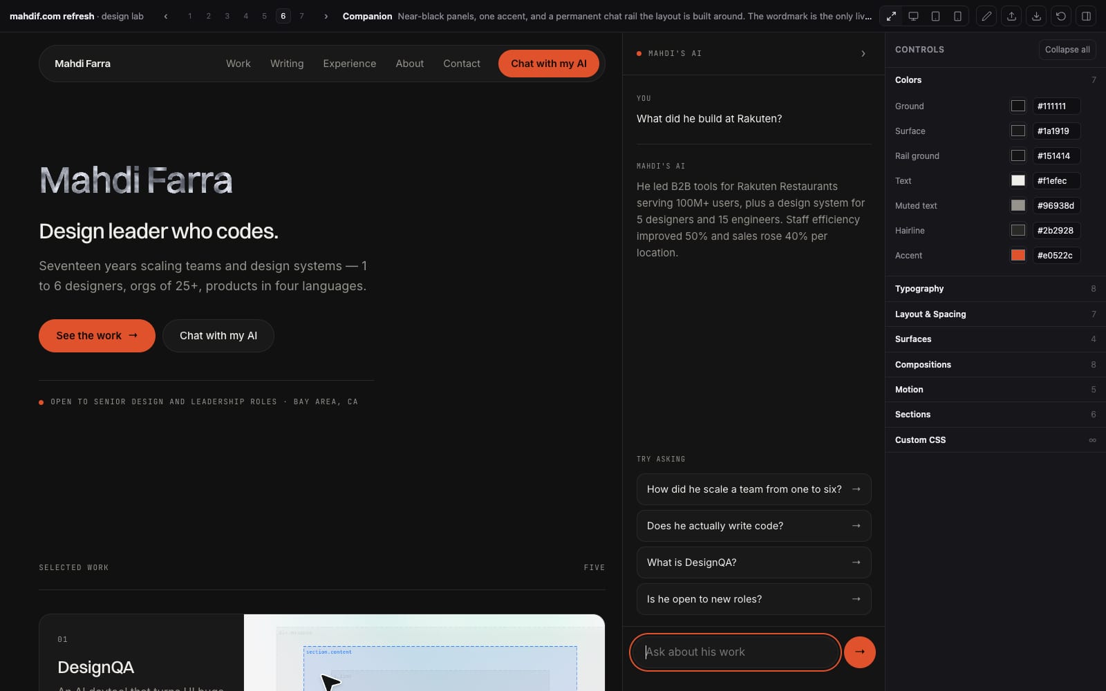
The design lab shell. A top bar numbers seven directions with the sixth, Companion, selected. The page fills the middle, and a controls panel on the right lists groups for colors, typography, layout, surfaces, compositions, motion and sections.
The lab. Seven directions across the top, Companion open, its 45 controls on the right.

Throw the mockups away. Keep the decisions.

My site got called AI-generated, and the fix was more AI, not less, pointed at exploration instead of production. AI can generate twelve versions of your taste. It can't tell you which one is yours.

4 hearts

Get new posts by email

I write when there is something worth saying. One email per post, nothing else.
No spam. Unsubscribe in one click.

  • ai
  • design
  • process
  • claude-code