I built a joke website in ten days. It made $10.
The honest accounting of a ten-day joke site. Not the launch post. What the agents built, where I launched it, and why $10 was the right number.

Update, September 26: it made $150 in the end. Here's what happened next, on video.
The site is ass.auction. A photo of a pair of boxers with 22 spots on them. You pay to put your logo on one. Everyone who has paid is ranked by what they have spent, the top 22 are worn on the boxers, and everyone below sits on a list. Someone spends more than you and you slide down, with your name in a public log. There is a chat, live cursors, sound effects, a handful of easter eggs, and a line at the top that says I will tattoo your logo on my ass, with an asterisk.
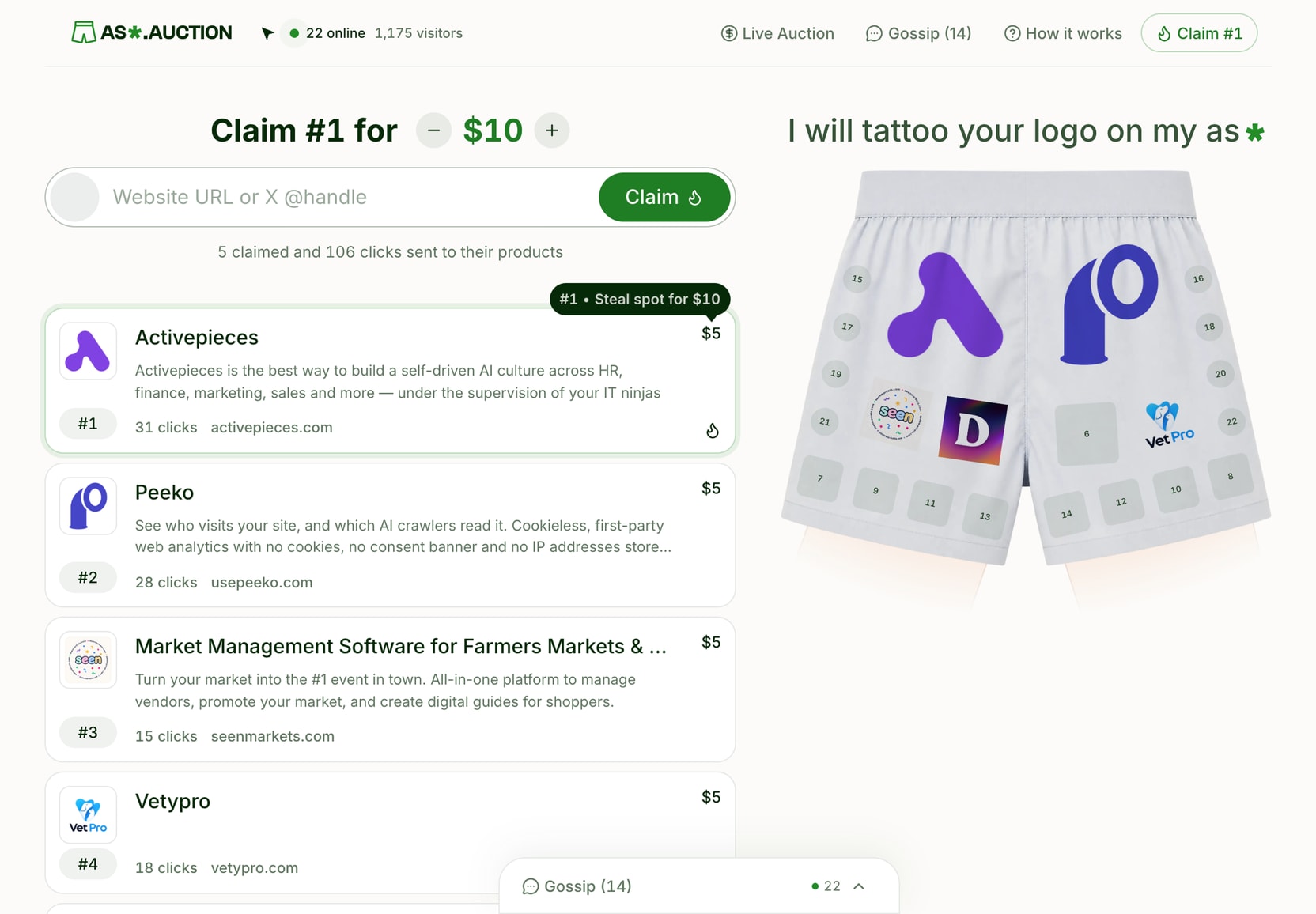
This post is the honest accounting. Not the launch post. The launch post already happened and nobody read it.
Why I built it
In late August a site called outbid.lol went around X. One page, one leaderboard, and you pay to rank higher on it. By its maker's own count it made $220,000 in five days. Within a week there were more than a hundred clones.
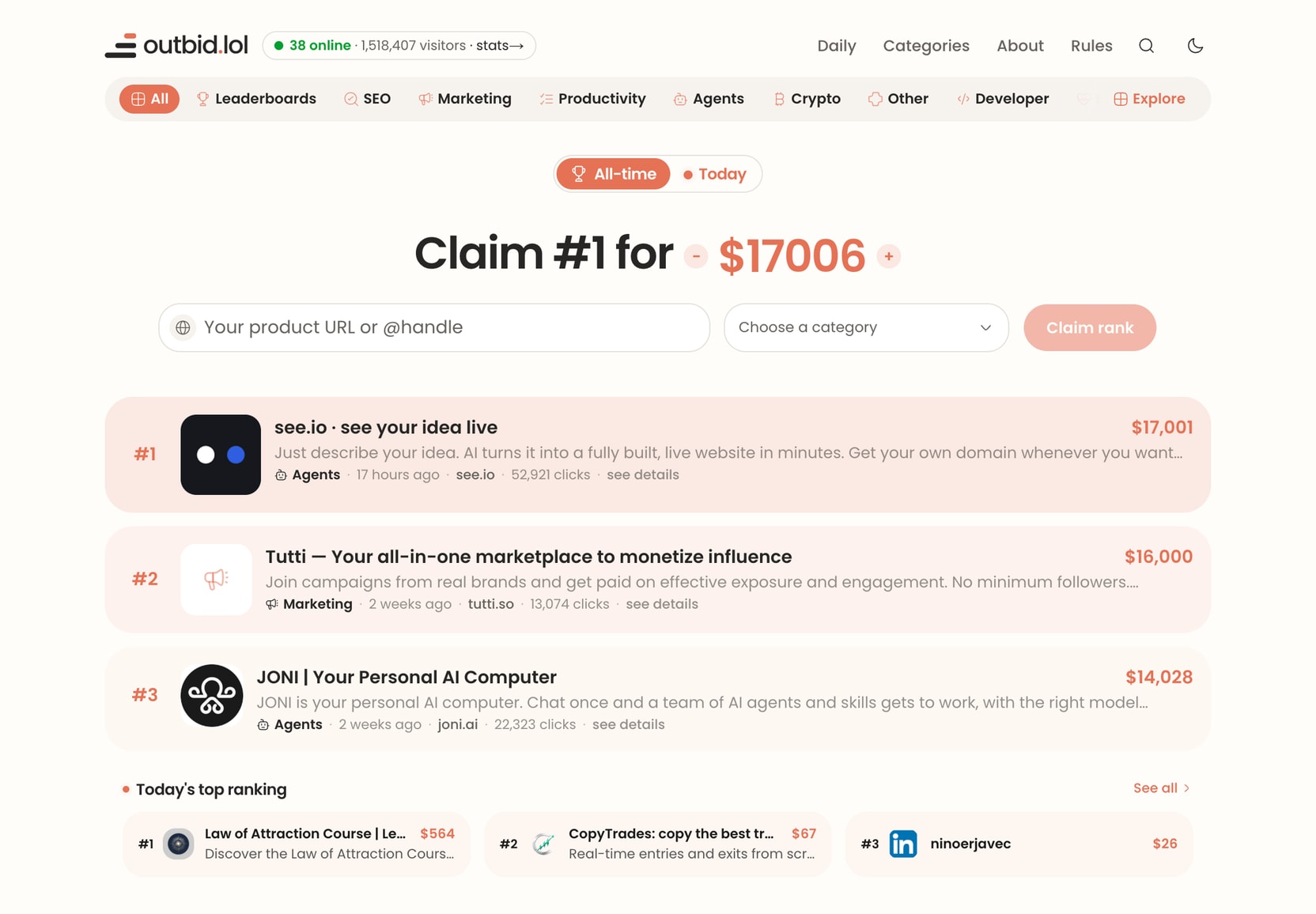
A friend said it would be funny to launch one that says I will tattoo your logo on my ass. I checked, and the domain was available. At that point I had to.
outbid.lol was about a week old when I started. The window looked short and the build looked small. Speed was the whole strategy.
I had also just shipped two serious products back to back, Peeko and Sondo. I wanted something with no roadmap and no customer interviews. A thing that was allowed to be dumb.
What ten days actually bought
I did not write most of the code, and I did not write the plan either. I dictated the brief and locked the decisions. An agent turned that into a plan, a second agent tore the plan apart before any code existed, and one conversation acted as the conductor. It split the work into packages and spawned a worker conversation for each one. I reviewed, pushed back, and merged.
The receipts, because they are the only interesting part:
A launch plan that went through an adversarial review before any code existed. 39 findings, most of them fixed before a single file was written.
A full redesign midway, in Figma.
Stripe checkout with a real price floor recomputed on the server, so nobody can pay less than a spot is worth by editing the page.
Outbid and confirmation emails. An unsubscribe flow that survived a security review I did not ask for, because an agent noticed that corporate mail scanners click every link in an email.
Live cursors, a chat with sign in, an admin dashboard, promo codes, and over 700 tests. Zero of them written by me.
It is, by a wide margin, the most polished thing I have ever shipped in ten days. And that is the problem.
The redesign
The first version took a day. The agents designed it themselves, in the browser, as plain HTML mock-ups. I picked the one I liked least badly and they built it. It worked, and it looked like every other site in the trend.
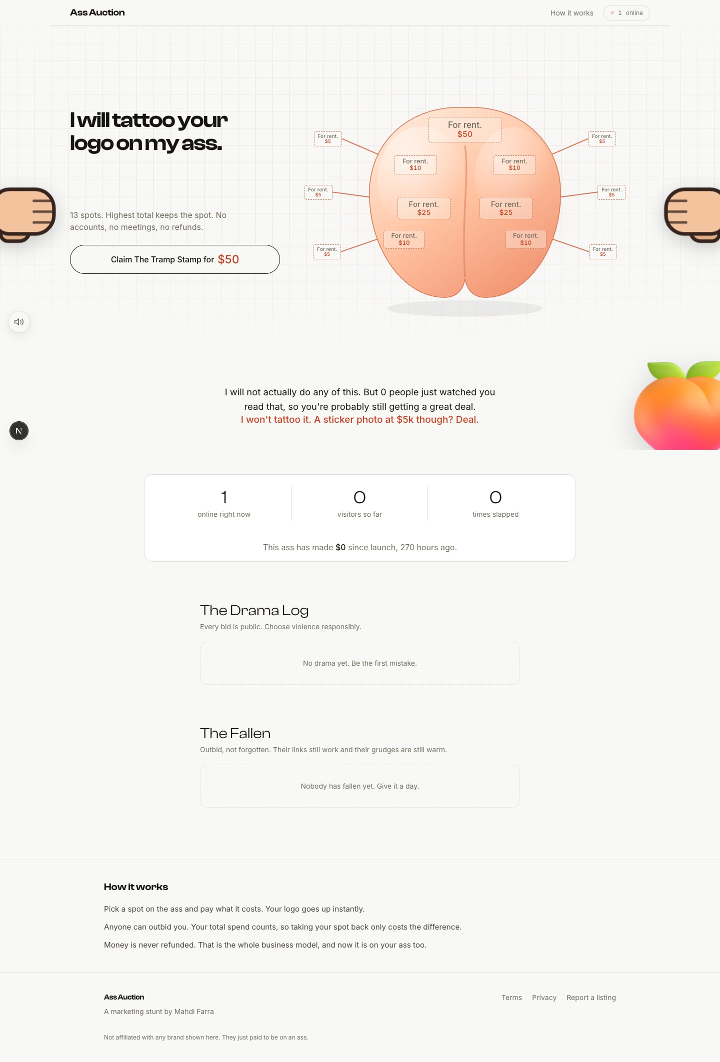
So I stopped and designed it properly in Figma. Seven frames. Then the agents threw away what they had built and did it again from those.
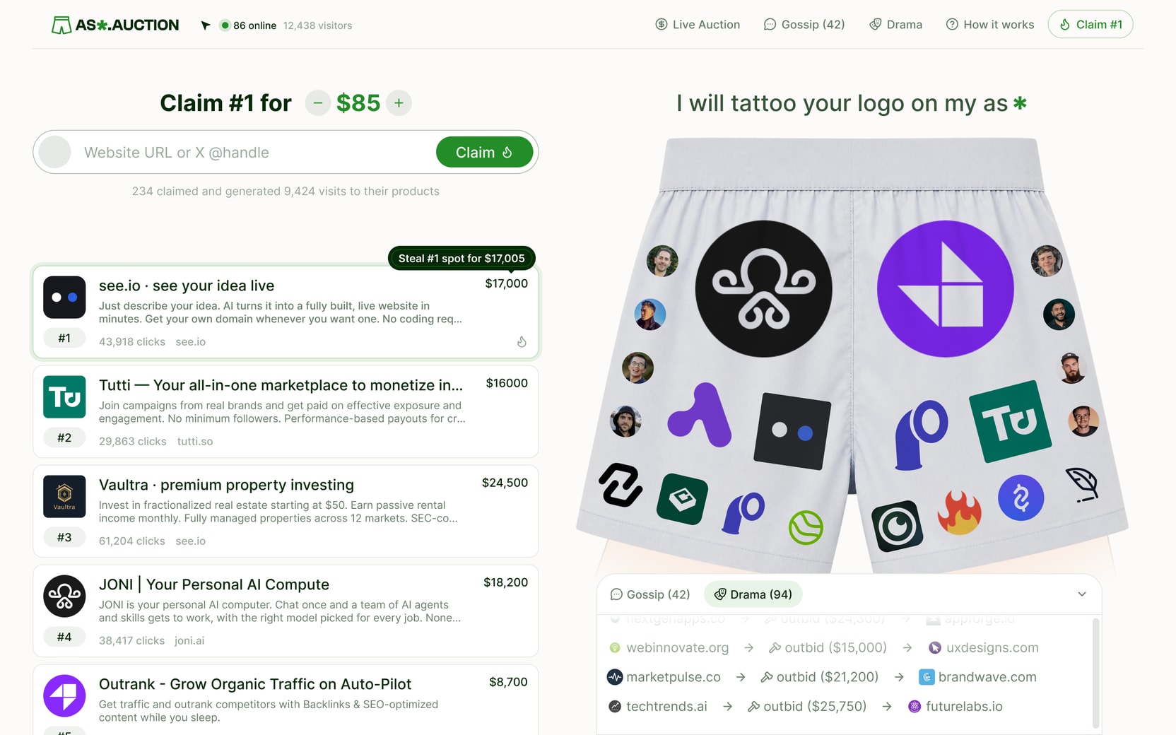
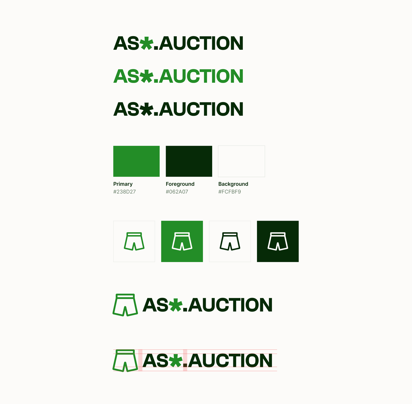
The part I enjoyed most was the branding, and it took more of the ten days than I should admit. The mark is a pair of boxers. The wordmark is the domain with the second s swapped for an asterisk, and the same asterisk closes the tattoo line above the boxers, so the joke and the logo share a glyph. Green because it felt fresh and positive, and because it sits well on cream, which is warmer and softer than white. The text is a very dark green rather than black, so nothing on the page is a colour the brand does not own. Everything is Inter. It is a small system, and it is one system.

How a spot changes hands
Here is the whole loop. You land, pick a spot, and bid. The price you are shown is a suggestion; the server recomputes it from the current standings before it will take your money, so nobody underpays by editing the page. You pay in Stripe and come back with your logo on the boxers. A confirmation email arrives when Stripe confirms the payment, not when you place the order.
Then someone spends more than you, and you get a second email telling you who knocked you down, with one link that opens the site already priced to take your rank back. Your own spending still counts, so climbing back only costs the difference. That link is the entire business model.
The details nobody asked for
This is the part I am actually proud of, so it gets its own section. Most of these were designed in Figma first and built by an agent from the frame. The rest came out of feedback rounds.
The tattoo line. Just under a second after the page loads, the sentence slides up from behind the boxers, and the asterisk at the end spins once so you know it does something. Hover it and the tooltip says it is a marketing stunt, obviously, and that your logo is on my ass right now, getting clicks.
Shake the boxers. Grab the boxers and shake them and every logo falls off with a gravity effect, lands in a heap at the bottom, and then climbs back up one by one. There are four sounds in that one gesture: the grab, the shake, the papers coming loose, and the first one landing.
Pull them down. Drag the boxers down past half their height and they come off. There is a cartoon butt underneath. Click the cheeks and they jiggle, with a slap. The slap is five separate recordings and the site picks one at random each time, because two hits on anything never sound the same, and you would not notice that until they did. I wrote about the same idea in 2021, when I rebuilt the clap reaction out of a handful of real claps. Click them ten times and a peach drops in, lands with a thud, and reveals a promo code for $5 off. A line underneath counts how many people have seen the ass. Hover it and you get confetti and a cheer, for having seen it.
Live cursors. Everyone on the page sees everyone else's cursor, positioned relative to the layout so they land in the same spot on every screen. There are eight colours, so past eight people you start sharing. My own cursor is the only one in ink and it carries a tiny pair of boxers, so people can tell when the admin is on the page without me saying anything. If they get in the way, a control in the header switches them off.

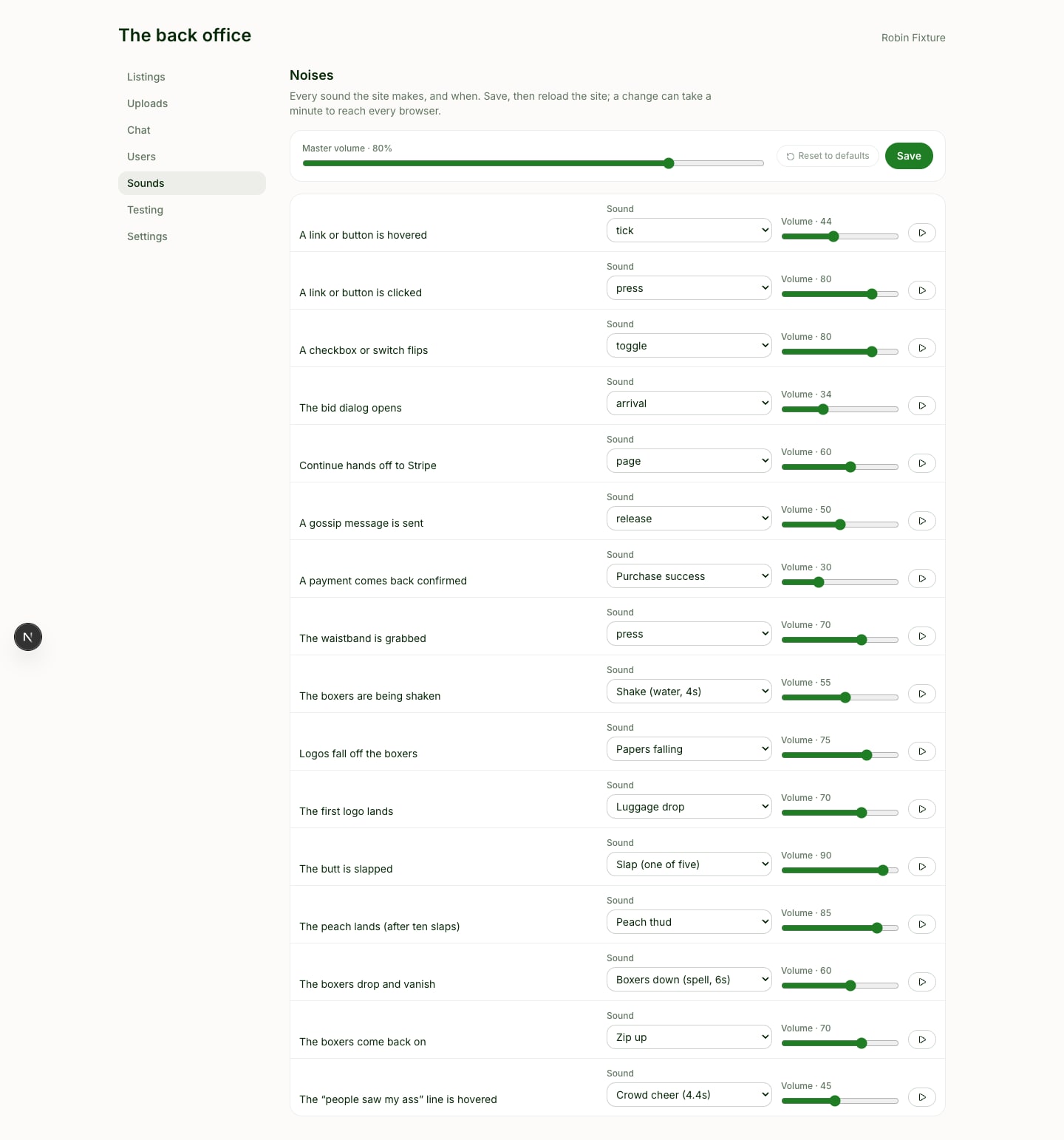
The sounds. Almost everything on the site makes one. Hover, press, toggle, a dialog opening, a message sent, the shake, the papers landing, the zip when the boxers go back on. The trick is the level. A hover tick sits at 44 and a dialog at 34, under a master at 80. You are not supposed to hear them. You are supposed to miss them when they are gone, the way you would miss the click of a door or the sound of a page turning. Silence is the thing that feels wrong. Every sound has its own volume in the admin, and one switch in the footer kills all of them.
The rest. The logo assembles itself on load, boxers first. Hover it in the header and the boxers wiggle. Hover my name in the footer and the pizza next to it wiggles. Hovering a logo on the boxers resets its rotation, pads it, and offers to steal the spot. Every claim and every outbid drops into the chat feed as its own line, so the timeline of who took what from whom writes itself. The site shows my handle and nothing else, I chat as The Auctioneer, and guessing who built it is part of the game.
None of this made anyone come.
The crowd I tried to fake
There is an admin dashboard with more knobs than the site has customers. Listings, uploads, chat, users, every sound on the site with its own volume, and a settings page I am not proud of.
It can add a number to the visitor total. It can pad the count of people online, drawing from a range I set, the same padded figure for everyone, drifting every ten minutes so it never looks static. It can pad the count of people who have seen the ass. It can give any listing invented clicks. There is a page that invents entire bidders with invented brand names and posts invented chatter from a cast of fake people, so the room is never empty while I am looking at it.
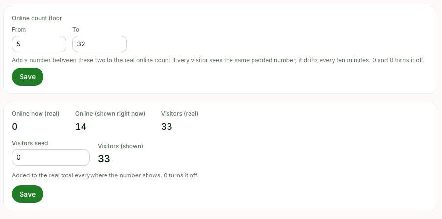
I turned all of it on. My own note to myself, still sitting in the admin page's source, says the number should read somewhere between five and thirty, because I wanted to create the perception that you are with other people. The online count sits in the header the entire time you are on the site. The chat has Google sign in, you can drag it along the bottom and resize it in both directions, and every claim and every outbid drops into it, so there would be something to argue about, the way people argue at a game.
One thing I want to be exact about, because the difference matters to me. The money counters never lied. Invented bidders carry no orders, so every figure about revenue excludes them by construction. What I padded was the appearance of company, not the appearance of sales.
It did not work. You cannot fake the thing the mechanic actually runs on. People stay because other people are there, and a padded number is not other people.
Launch day, by the numbers
I opened the site on September 4. I posted about it on X a handful of times, replied under other people's tweets, and posted it on Reddit.
I track the site with Peeko, my own analytics product, so I have the whole funnel rather than a feeling. Everything below is the first five days, September 4 to 8, before Product Hunt, straight out of the Peeko command line, with nothing seeded on the analytics side.
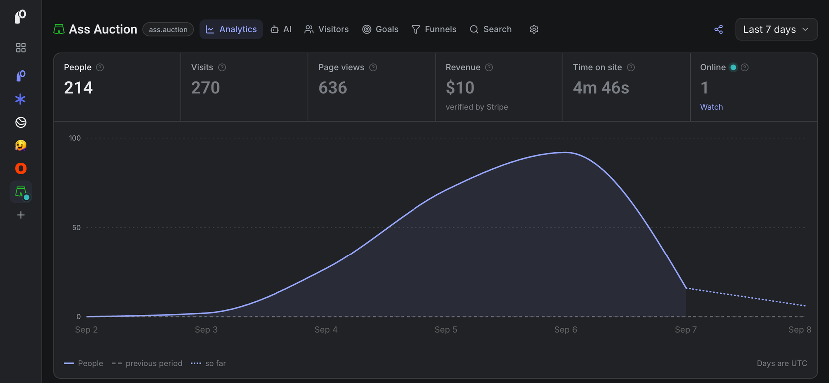
People: 214 Visits: 270 Page views: 636 Time on site: 4 minutes 46 seconds Left after one page: 68%
Where they came from: 85% direct, which mostly means people pasting a link from a DM or a group chat. Then Reddit with 19 views, X with 18, Bluesky with 13, Hacker News with 3, LinkedIn with 3.
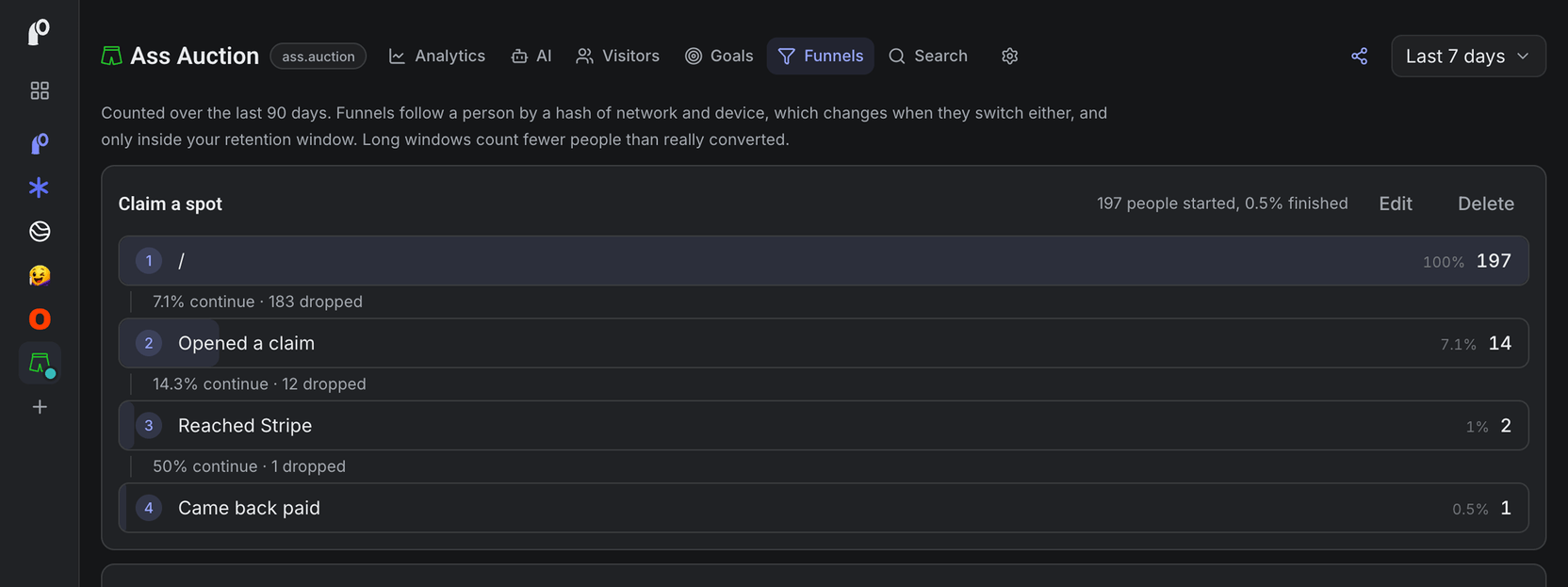
Opened the claim dialog: 18 people Opened a steal: 13 people Reached Stripe: 5 people Paid: 3 orders. Two at $5, and one friend who found the coupon hidden behind the peach and used it to put his site on the boxers for free
The funnel end to end, from landing on the page to paying within the hour: 197 people in, 1 out. Half a percent.
Now the part that made the whole thing worth it to me:
Pulled the boxers down: 7 people Shook the logos off: 4 people Slapped it: 173 times, by 6 people Found the secret code behind the peach: 5 people Shared it on X with the share button: 0
Six people slapped a cartoon butt 173 times between them. Nobody shared it. That is the entire launch in two lines.
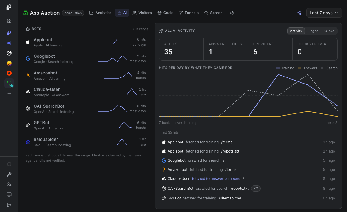
One more number. 35 crawler requests in those five days, and 14 of them came from OpenAI's bots. Google sent 9. The AI companies read the site more carefully than the humans did.
$10.
Peeko tied one of the two paid sales to a direct visit and could not tie the other to anything. I assumed the checkout was not passing Peeko's page token to Stripe. It was, since the day before launch. The likely cause is that the tracker script is cached for four hours, so a returning buyer can be running an older copy with no token in it. So even the $10 taught me something about my own product.
What the $10 taught me
The trend was real. The mechanic worked. The site worked. None of that was the bottleneck.
The bottleneck was that I launched it where I have nobody. My X account is small. My Reddit account is smaller. The site that made real money on this mechanic was built by someone with an audience who could make the first ten bids happen in an afternoon. The mechanic only works once the drama starts, and the drama needs a crowd.
I have a crowd. It is on LinkedIn, and it is over four thousand people, many of them founders and senior designers. I could not send them a site with that name. I knew that on day one. By launch I had even hidden my own name on the site and given myself a pseudonym in the chat.
So I built a viral machine that could not be pointed at the only audience I have.
That hit me harder than the number.
The part I got wrong on purpose
I spent the ten days on the details above. Every one of them made the site better, and none of them made anyone come.
I know this pattern. Three weeks earlier, my analytics product had zero signups, and I wrote in its own progress log that zero signups is an audience problem, not a plumbing one. Then I went and built ten more days of plumbing on a different product.
Building is where I feel in control. Distribution is where I do not. So I build.
Where the human stays
I do not regret the ten days. The multi-agent workflow I used to build it is now the way I build everything, and this was the project that proved it on something with real payments and real users. That is worth more than $10 to me.
I regret the order. Audience first, then the machine that needs one. I had that written down and did it backwards anyway.
If you are about to launch something
Count the people you can actually reach before you count the features. If the number is small, the launch is a post, not a product.
Name the thing so you can show it to everyone you know. If you have to hide it from your main channel, you have already cut your distribution in half.
Write the honest post afterward either way. It is the only part of the launch that reaches the people you have.
The site made $10. This post is the first thing from those ten days that gets to go where my audience is.
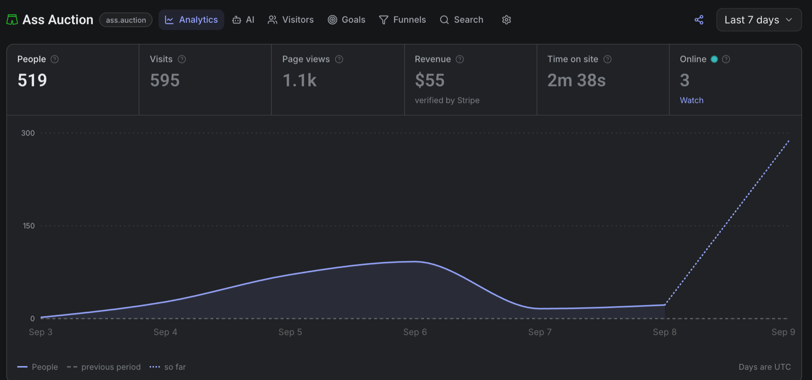
It is also on Product Hunt, as of midnight. Same site, same joke, same 22 spots. By eight in the morning it was ninth for the day, and three companies I had never heard of had outbid each other for the top spot, at $10, then $15, then $20. That is $45 in eight hours, against $10 in the first five days. Nothing about the site changed. Only who was looking.
Get new posts by email
I write when there is something worth saying. One email per post, nothing else.

- build-in-public
- ai
- launch
- peeko